Combined chart
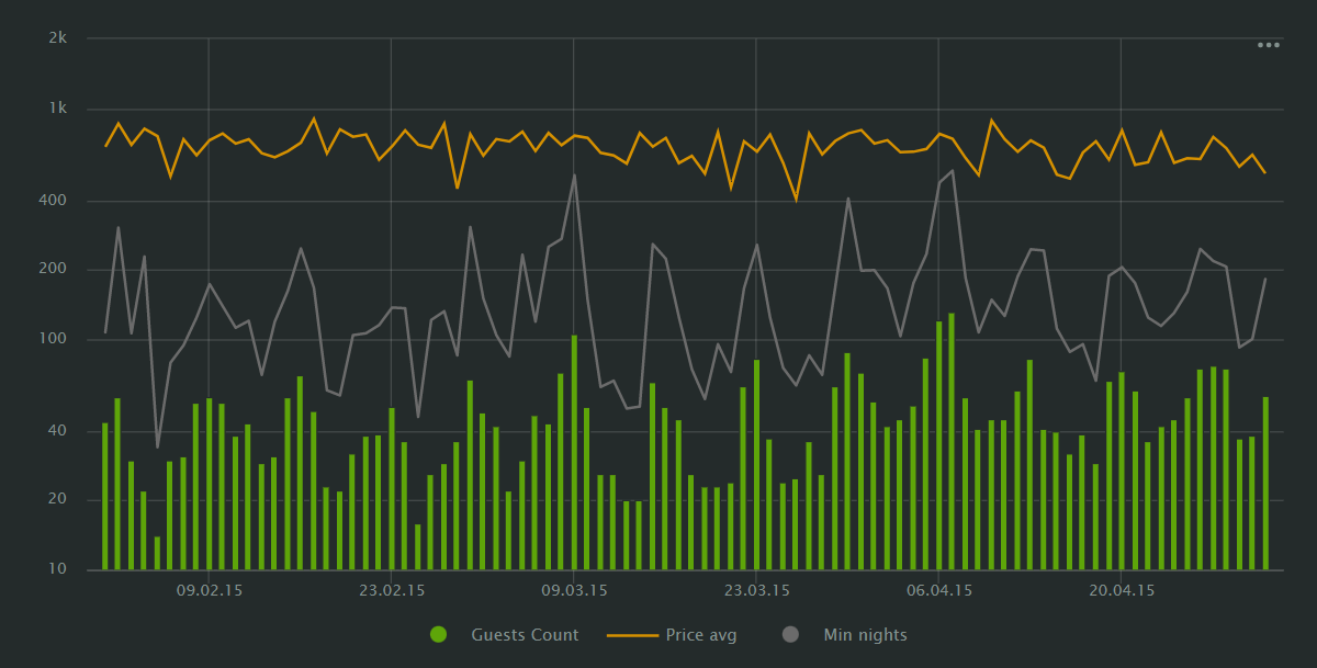
A combined chart displays multiple data visualizations within the same coordinate space.
Unlike the split function, this chart can combine different data fields in a single visualization, thus allowing you to compare multiple data streams within a single chart.
You can combine a line chart, a stacked area chart, and a column chart within the same visualization.

For example, you can use this chart type to visualize trends influenced by multiple parameters, like the influence of the number of guests and bookings on the average price.
AI-Insights not supported
This chart type doesn’t support the AI-Insights feature.
-
Open the All workbooks page and select your workbook.
-
Click Create → Wizard chart. You'll see the chart creation wizard.
-
On the top left, select the Dataset you want to visualize.
-
Click the chart type field on the right of the dataset section and select Combined chart from the drop-down menu.
-
Drag and drop the measure or dimension to the X section. It'll apply to all the layers in your chart.
-
Select the chart type you want to apply to the first layer. You can choose a line chart, a stacked area chart, or a column chart.
-
To add more layers, click + on the right of the layer selection field.
You can drag and drop the layers in the drop-down menu to rearrange them - the higher layer will overlay the lower one.
-
Drag and drop Measures and Dimensions to the appropriate sections of the layer.
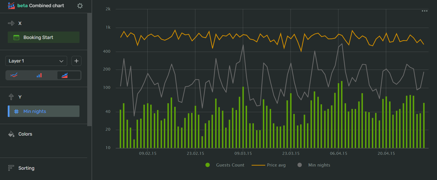
Your chart creation wizard should look similar to the following:

-
Click Save in the upper-right corner of the page.
-
Name your chart and click Done.
-
Choose the appropriate location for your chart by dragging it around the dashboard and resize it by dragging the lower-right corner of its frame.
-
Click Save in the upper-right corner of the page.
| Wizard slot | Description |
|---|---|
| X | Dimension. It applies to all the layers in the chart. |
| Layers | Add and rearrange layers, select chart types for each layer. |
Other slots depend on the chart type selected for the layer:
To open data type settings, click the field type icon before the field name:
-
for
Integertype fields:Name
Description
Possible values
Name
Sets the name of the measure
A string of characters.
Type (Before aggregation)
Sets the field's data type.
Integer,Fractional number,String,Logical,Date,Date and timeAggregation
Applies a selected aggregation function to the data field.
No: doesn't apply aggregation. Count: applies the COUNT function, returns the total number of entries. Sum: applies the SUM function, returns the sum of all the field's values. Average: applies the AVG function, returns the arithmetic mean value. Minimum: applies the MIN function, returns the minimum value. Maximum: applies the MAX function, returns the maximum value. Count distinct: applies the COUNTD function to the data field and returns the number of unique values in the field.
Label
Displays labels with values on the chart.
Show,HideFormat
Sets the value display format
Number: display the values as plain numbers. Percent: show the values as a percentage.
Show delimiter
Toggles the separation of groups of thousands.
Show: display spaces between groups of thousands. Hide: hide spaces between groups of thousands.
Prefix
Sets a text to display before the value
A string of characters.
Postfix
Sets a text to display after the value.
A string of characters.
Units
Sets a rounding scale to apply to the field's values.
Null: don't apply rounding.Auto: select and apply a rounding scale automatically.Thousands, K: round to thousands, display000asK.Millions, M: round to millions, display000 000asM.Billions, B: round to billions, display000 000 000asB.Trillions, T: round to trillions, display000 000 000 000asT. -
for
Stringtype fields:Name
Description
Possible values
Name
Sets the name of the dimension
A string of characters.
Type
Sets the field's data type.
Integer,Fractional number,String,Logical,Date,Date and timeAggregation
Sets the aggregation type
No: doesn't apply aggregation. Count: applies the COUNT function to the data field and shows the number total number of entries. Count distinct: applies the COUNTD function to the data field and returns the number of unique values in the field.
-
for
Datetype fields:Name
Description
Possible values
Name
Sets the name of the dimension
A string of characters.
Type
Sets the field's data type.
Integer,Fractional number,String,Logical,Date,Date and timeGrouping
Sets the grouping and rounding by time period.
No - doesn't apply grouping. Rounding - rounds the values by
Year,Quarter,Month,WeekorDay. Date part - returns the number of a time period:Year,Quarter,Month,Week,Day of week, orDay.Date mode
Toggles the date display mode.
Continuous - display all the dates continuously. Discrete - show the dates containing values.
Aggregation
Applies a selected aggregation function to the data field.
No: doesn't apply aggregation. Count: applies the COUNT function, returns the total number of entries. Minimum: applies the MIN function, returns the minimum value. Maximum: applies the MAX function, returns the maximum value. Count distinct: applies the COUNTD function to the data field and returns the number of unique values in the field. Average: applies the AVG function, returns the arithmetic mean value.
-
for
Geodatatype fields:Name
Description
Possible values
Name
Sets the name of the data field
A string of characters.
Type
Sets the field's data type.
Integer,Fractional number,String,Logical,Date,Date and time,Geopoint,GeopolygonAggregation
Sets the aggregation type
No: doesn't apply aggregation. Count: applies the COUNT function to the data field and shows the total number of entries.
Column fill color
Fills the cells with different colors from a gradient depending on the value.
On: apply the color fill.Off: remove color fill.
To open chart settings, click
| Control | Default state | Description |
|---|---|---|
| Header | Off |
Displays the specified text in the centered line above the chart. |
| Legend | On |
Displays the field name associated with colors of the charts on the layers below the chart. |
After managing the controls, click Apply to see the results on the chart preview.
To open slot settings, click
X:
| Setting | Description | Possible values |
|---|---|---|
| Axis title | Sets an axis label. | Auto: Uses a field name. If the section contains several fields, Visualization uses the name of the field added to the list first. Manual: Allows you to enter an axis title manually. Off: Axis will have no label. |
| Axis type | Sets the axis type. The setting is available for fields in the axis section that have the Fractional number type. | Linear: Sets a linear axis type. Logarithmic: Sets a logarithmic axis type, preferable for charts with a wide range of values. A logarithmic axis allows you to display a fast-growing graph in a convenient form for analysis, reducing values by order of magnitude. |
| Grid | Displays a grid on the chart. | On: Displays the grid.Off: Hides the grid. |
| Grid step | Sets the grid spacing in pixels. | Auto: Sets the grid size automatically. Manual: Allows you to set the grid size in pixels. |
| Labels | Displays data field labels on the chart. | On: Displays labels.Off: Hides labels |
| Labels view | Sets the appearance of the label display. The setting is available if the Labels setting is set to On. |
Auto: Positions label values automatically. Horizontal: Positions label values horizontally. Vertical: Positions label values vertically. Angle: Displays label values at a 45-degree angle. |
| Empty values (null) | Specifies how to process empty values. Not supported by Scatter chart. |
Ignore: Doesn't display empty values in a chart. Connect: Joins values of fields that have empty values between them. Display as 0: Displays empty values in charts as zero (0) field values. |
| Scaling | Sets the scale of chart axes. | Auto: Sets the scale automatically. You can specify how Visualization sets the scale: from the minimum to the maximum field values (Autoscale from min to max) or from 0 to the maximum field value (Autoscale from 0 to max). Manually: Allows you to set the axis scale manually. You can set the maximum and minimum values along the axis. Visualization trims the chart lines by this value. |
Other slot settings depend on the chart type selected for the layer:
-
When visualizing multiple measures, consider which colors you select for them. For better readability, choose contrasting and easy-to-distinguish colors.
-
When visualizing multiple measures, consider which of them needs the most attention. For better readability, put the most important measure at the bottom of the fields list and the measure against which you want to compare it - at the top.