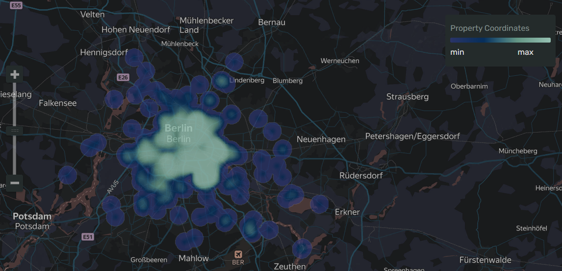
Heat map
A heat map shows the density of point distribution as colored map areas with a gradient ranging from green to red. The more points in an area, the closer its color is to red.
A heat map is most effective when working with a dataset that contains a lot of points located within a small geographic area. If there's a limited number points on a map, link the color to a measure value: the higher the value, the closer the point color to red.

A heat map helps find dependencies that may not be in plain sight on a regular points map due to overlapping. For example, you can use a heat map to determine the districts where customers order for delivery most often.
AI-Insights not supported
This chart type doesn’t support the AI-Insights feature.
-
Open the All workbooks page and select your workbook.
-
Click Create → Wizard chart. You'll see the chart creation wizard.
-
On the top left, select the Dataset you want to visualize.
-
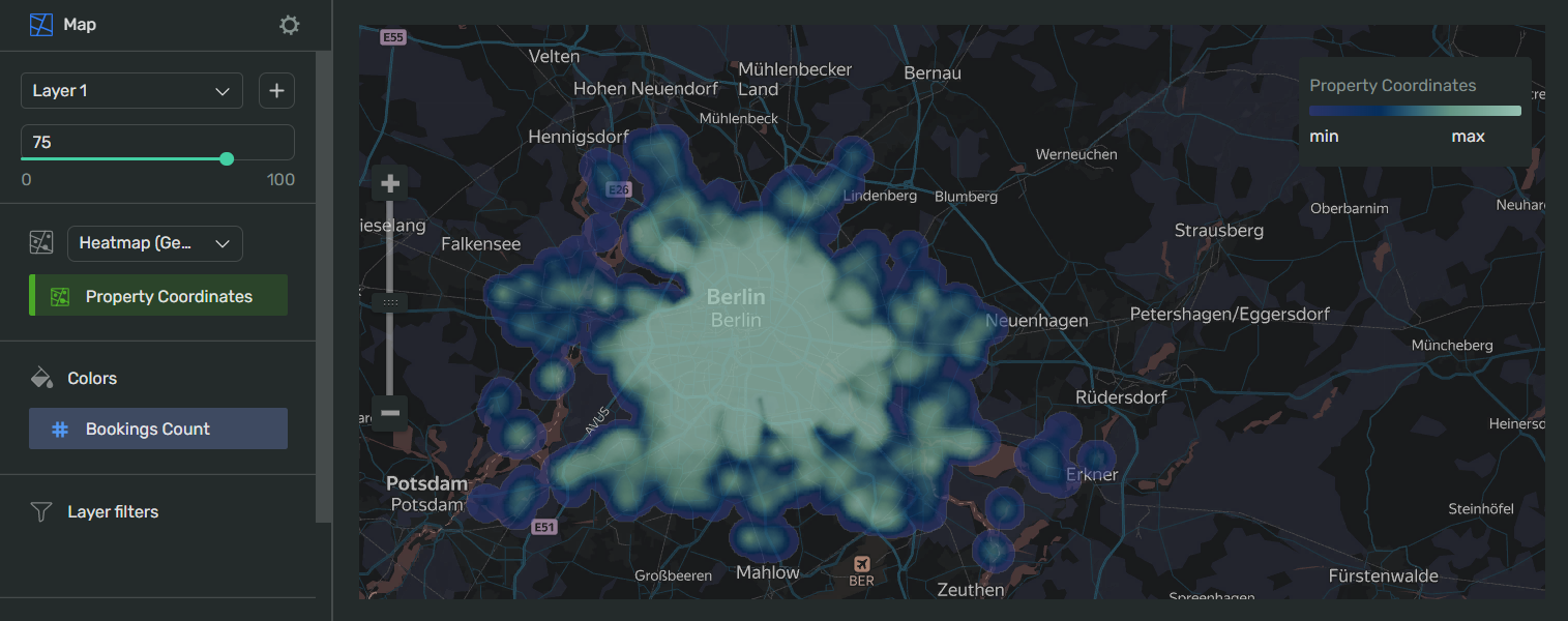
Click the chart type field on the right of the dataset section and select Map from the drop-down menu, then choose Heatmap (Geopoints) in the map type drop-down menu.
-
Drag and drop a measure to the appropriate sections of the chart (see the Data fields tab).
-
Set the size of the points displayed on the point map. Drag a measure to the Point size section.
-
Apply color to your points - drag a measure to the Colors section.
Your chart creation wizard should look similar to the following:

-
Click Save in the upper-right corner of the page.
-
Name your chart and click Done.
-
Choose the appropriate location for your chart by dragging it around the dashboard and resize it by dragging the lower-right corner of its frame.
-
Click Save in the upper-right corner of the page.
| Wizard slot | Description |
|---|---|
| Points (Geopoints) | Dimension or Measure. Single-field slot. Must contain a geopoint. |
| Point size | Measure. Sets a point size depending on the measure value. |
| Colors | Dimension or Measure. Affects the area gradient colors. |
| Layer filters | Dimension or Measure. Used as a filter for the current layer. You can add a Measure Names or Measure Values field to this slot. |
| Chart filters | Dimension or Measure. Used to filter values. You can add a Measure Names or Measure Values field to this slot. |
To open chart settings, click
| Control | Default state | Description |
|---|---|---|
| Header | Off |
Displays the specified text in the centered line above the chart. |
| Legend | On |
Displays the dimension or measure and a color value gradient in a frame in the upper-right corner of the chart. |
After managing the controls, click Apply to see the results on the chart preview.
Colors:
- Gradient type toggles between gradients based on
2or3colors. - Drop-down menu selects the gradient color palette. The preview is displayed to the left.
- The button changes the gradient's direction.
- Threshold values allow you to specify how the color changes, from the lowest values to the highest. Each threshold value corresponds to a color.
-
The intensity of point and area fill on a heat map varies depending on the map's scale. Keep this in mind.
-
If the areas cover too much space on the map so that they compromise legibility, make them more transparent.