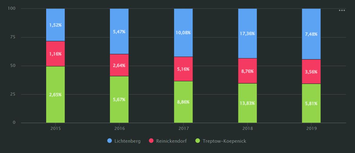
Normalized column chart
A normalized column chart shows the contribution of each measure or category to the total amount. Segments have different colors and stack one above the other. The height of a segment indicates its ratio to the total amount.

For example, the percentage of revenue for different city boroughs.
AI-Insights supported
Use the AI-Insights feature with this chart type.
-
Open the All workbooks overview page and select your workbook.
-
Click Create → Wizard chart. You'll see the chart creation wizard.
-
On the top left, select the Dataset you want to visualize.
-
Click the chart type field on the right of the dataset section and select Normalized column chart from the drop-down menu.
-
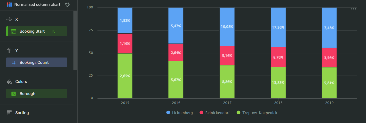
Drag and drop Measures and Dimensions to the appropriate sections of the chart (see the Data fields tab).
Your chart creation wizard should look similar to the following:

-
Click Save in the upper-right corner of the page.
-
Name your chart and click Done.
-
Choose the appropriate location for your chart by dragging it around the dashboard and resize it by dragging the lower-right corner of its frame.
-
Click Save in the upper-right corner of the page.
Note
This configuration is a segment in the overall description of Visualization assets in the workbook. For the complete tutorial, see Use Visualization API.
To describe a normalized column chart, use the ColumnChartNormalized configuration:
-
name- your chart's name. Must be unique within the workbook. -
dataset- the ID of the dataset whose data to visualize. -
ad_hoc_fields- (optional) describe the calculated fields to use in the chart:-
title: the field's title. -
id- the ID of the calculated field. Must be unique within the dataset. -
cast- the field's Visualization-specific data type -
description- (optional) the field's description in plain text format. -
hidden- (optional) iftrue, doesn't the field in the dataset's field list. If unspecified, defaults tofalse. -
aggregation- applies aggregation to the field. -
calc_spec- defines the data field specification.
-
-
visualization- describe the configuration of your chart:-
kind: column_chart_normalized- specify the chart type. -
y- configure the data reference for the Y axis:-
source- specify the data source:-
kind: ref- take the data from the reference data source. This is the dataset specified above. -
id- specify the ID of the data field from the dataset whose data will be used to visualize the Y axis.
-
-
-
x- configure the data reference for the X axis:-
source- specify the data source:-
kind: ref- take the data from the reference data source. This is the dataset specified above. -
id- specify the ID of the data field from the dataset whose data will be used to visualize is the X axis.
-
-
-
sort- specify the data field to be used as a sorting reference:-
source- specify the data source:-
kind: ref- take the data from the reference data source. This is the dataset specified above. -
id- specify the ID of the data field from the dataset whose data to use as sorting reference.
-
-
direction- configure the sorting direction to apply to the chart. You can assignASCfor ascending orDESCfor descending.
-
-
coloring(optional):-
kind- specify which data type field to use as a color filter. You can specifya dimensionormeasure. -
source- specify the data source:-
kind: ref- take the data from the reference data source. This is the dataset specified above. -
id- specify the ID of the data field from the dataset whose data will be used as a color filter.
-
-
palette_id- select the palette to apply to the chart. For most cases, usedefault-palette. -
mounts- assign colors from the palette to data points from the source:-
value- specify the exact value from thesource. -
color_idx- match the above value to a color swatch number in the palette.
-
-
-
API example
- name: ch_colums_normalized_sales_per_region_and_category
chart:
   datasets:
   - ds_sales
   ad_hoc_fields: []
   visualization:
      kind: column_chart_normalized
      x:
      source:
         kind: ref
         id: order_month
      y:
      - source:
         kind: ref
         id: sum_sales
      sort: []
      coloring: null
| Wizard slot | Description |
|---|---|
| X | Dimension. |
| Y | Measure. Multiple-field slot. If you add more than one field to this slot, the Measure Names field will appear in the Colors slot. |
| Colors | Dimension or Measure Names. Affects line colors.You can add a Measure Names or Measure Values field to this slot.You can delete the Measure Names field by removing fields from the Y and/or Y2 slots. |
| Sorting | Measure. Measures from the x-axis. Affects the sorting of the x-axis. |
| Signatures | Dimension or Measure. Shows dimension values on the chart. You can add a Measure Names or a Measure Values field to this slot. |
| Split | Measure as a category. Separates a single chart into multiple by category. |
| Chart filters | Dimension or Measure. Used to filter values. You can add a Measure Names or Measure Values field to this slot. |
{% include [coordinate-based-field-settings.md](../../_includes/visualization/coordinate-based-field-settings.md) %}
To open chart settings, click
| Control | Default state | Description |
|---|---|---|
| Header | On |
Displays the specified text in the centered line above the chart. |
| Legend | On |
Displays the field name associated with color line below the chart. |
| Sum in tooltips | On |
Displays the sum of the values of all the lines on data point hover. |
| Labels overlap | Off |
Allows the labels with a large amount of text to overlap. Use with caution - this may negatively affect the labels readability. |
After managing the controls, click Apply to see the results on the chart preview.
To open slot settings, click
X and Y axes:
| Setting | Description | Possible values |
|---|---|---|
| Axis title | Sets an axis label. | Auto: Uses a field name. If the section contains several fields, Visualization uses the name of the field added to the list first. Manual: Allows you to enter an axis title manually. Off: Axis will have no label. |
| Axis type | Sets the axis type. The setting is available for fields in the axis section that have the Fractional number type. | Linear: Sets a linear axis type. Logarithmic: Sets a logarithmic axis type, preferable for charts with a wide range of values. A logarithmic axis allows you to display a fast-growing graph in a convenient form for analysis, reducing values by order of magnitude. |
| Grid | Displays a grid on the chart. | On: Displays the grid.Off: Hides the grid. |
| Grid step | Sets the grid spacing in pixels. | Auto: Sets the grid size automatically. Manual: Allows you to set the grid size in pixels. |
| Labels | Displays data field labels on the chart. | On: Displays labels.Off: Hides labels |
| Labels view | Sets the appearance of the label display. The setting is available if the Labels setting is set to On. |
Auto: Positions label values automatically. Horizontal: Positions label values horizontally. Vertical: Positions label values vertically. Angle: Displays label values at a 45-degree angle. |
| Empty values (null) | Specifies how to process empty values. Not supported by Scatter chart. |
Ignore: Doesn't display empty values in a chart. Connect: Joins values of fields that have empty values between them. Display as 0: Displays empty values in charts as zero (0) field values. |
| Scaling | Sets the scale of chart axes. | Auto: Sets the scale automatically. You can specify how Visualization sets the scale: from the minimum to the maximum field values (Autoscale from min to max) or from 0 to the maximum field value (Autoscale from 0 to max). Manually: Allows you to set the axis scale manually. You can set the maximum and minimum values along the axis. Visualization trims the chart lines by this value. |
Colors:
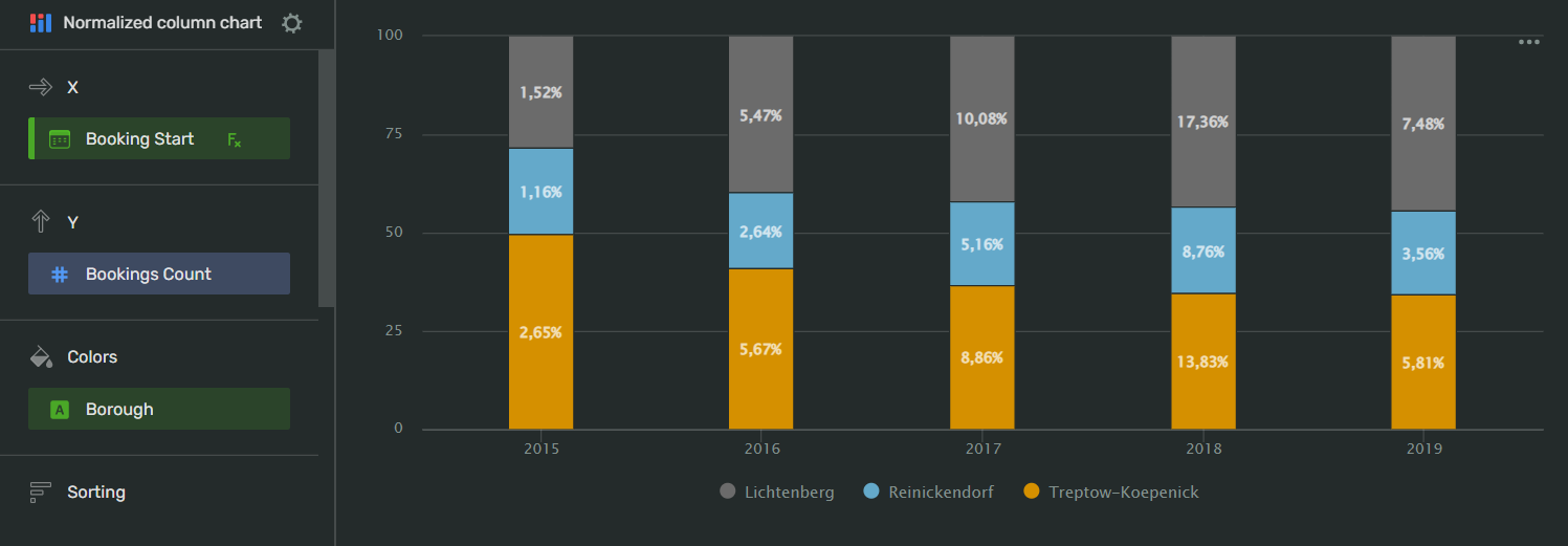
On the left, you can select a line from a data source in the Colors slot of your chart.
On the right, you can select a color scheme and a color for the line. Select AUTO to let Visualization do the coloring for you.
-
When visualizing multiple measures, consider which of them needs the most attention. For better readability, put the most important measure at the bottom of the fields list and the measure against which you want to compare it - at the top:

-
We recommend displaying no more than three to five measures in a chart.
-
To display the values for each data point, drag Measure values to the Signatures section.