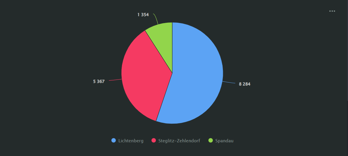
Pie chart
A pie chart displays a circle divided into sectors to illustrate a proportion of elements.
The entire circle area represents the sum of all categories. The area of each segment corresponds to the percentage of a category in the total amount.

For example, pie charts are useful for demonstrating proportions of a small number of segments.
AI-Insights supported
Use the AI-Insights feature with this chart type.
-
Open the All workbooks overview page and select your workbook.
-
Click Create → Wizard chart. You'll see the chart creation wizard.
-
On the top left, select the Dataset you want to visualize.
-
Click the chart type field on the right of the dataset section and select Pie chart from the drop-down menu.
-
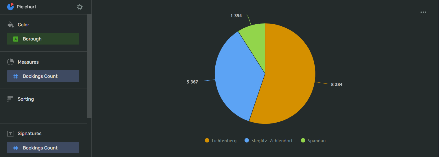
Drag and drop Measures and Dimensions to the appropriate sections of the chart (see the Data fields tab).
Your chart creation wizard should look similar to the following:

-
Click Save in the upper-right corner of the page.
-
Name your chart and click Done.
-
Choose the appropriate location for your chart by dragging it around the dashboard and resize it by dragging the lower-right corner of its frame.
-
Click Save in the upper-right corner of the page.
| Wizard slot | Description |
|---|---|
| Color | Dimension or Measure Names. Affects line colors.You can add a Measure Names or Measure Values field to this slot. |
| Measures | Measure. Single-field slot. |
| Sorting | Measure. Affects the sorting of the measures. |
| Signatures | Dimension or Measure. Shows dimension values on the chart. You can add a Measure Names or a Measure Values field to this slot. |
| Chart filters | Dimension or Measure. Used to filter values. You can add a Measure Names or Measure Values field to this slot. |
To open field settings, click the field type icon before the field name:
-
for
Integertype fields:Name
Description
Possible values
Name
Sets the name of the measure
A string of characters.
Type (Before aggregation)
Sets the field's data type.
Integer,Fractional number,String,Logical,Date,Date and timeAggregation
Applies a selected aggregation function to the data field.
No: doesn't apply aggregation. Count: applies the COUNT function, returns the total number of entries. Sum: applies the SUM function, returns the sum of all the field's values. Average: applies the AVG function, returns the arithmetic mean value. Minimum: applies the MIN function, returns the minimum value. Maximum: applies the MAX function, returns the maximum value. Count distinct: applies the COUNTD function to the data field and returns the number of unique values in the field.
Label
Displays labels with values on the chart.
Show,HidePrecision
Sets the number of characters displayed after the decimal point in a value.
Any positive integer.
Format
Sets the value display format
Number: display the values as plain numbers. Percent: show the values as a percentage.
Show delimiter
Toggles the separation of groups of thousands.
Show: display spaces between groups of thousands. Hide: hide spaces between groups of thousands.
Prefix
Sets a text to display before the value
A string of characters.
Postfix
Sets a text to display after the value.
A string of characters.
Units
Sets a rounding scale to apply to the field's values.
Null: don't apply rounding.Auto: select and apply a rounding scale automatically.Thousands, K: round to thousands, display000asK.Millions, M: round to millions, display000 000asM.Billions, B: round to billions, display000 000 000asB.Trillions, T: round to trillions, display000 000 000 000asT. -
for
Stringtype fields:Name
Description
Possible values
Name
Sets the name of the dimension
A string of characters.
Type
Sets the field's data type.
Integer,Fractional number,String,Logical,Date,Date and timeAggregation
Sets the aggregation type
No: doesn't apply aggregation. Count: applies the COUNT function to the data field and shows the number total number of entries. Count distinct: applies the COUNTD function to the data field and returns the number of unique values in the field.
-
Datetype fields will convert intoInteger. -
Geodatatype fields aren't supported by this chart type.
To open chart settings, click
| Control | Default state | Description |
|---|---|---|
| Header | On |
Displays the specified text in the centered line above the chart. |
| Legend | On |
Displays the field name associated with color line below the chart. |
After managing the controls, click Apply to see the results on the chart preview.
To open slot settings, click
Color:
On the left, you can select a line from a data source in the Colors slot of your chart.
On the right, you can select a color scheme and a color for the line. Select AUTO to let Visualization do the coloring for you.
-
This chart type can't display
NULLor negative values. -
We recommend displaying no more than three to six measures in a chart.
-
To display the values for each data point, drag Measure values to the Signatures section.