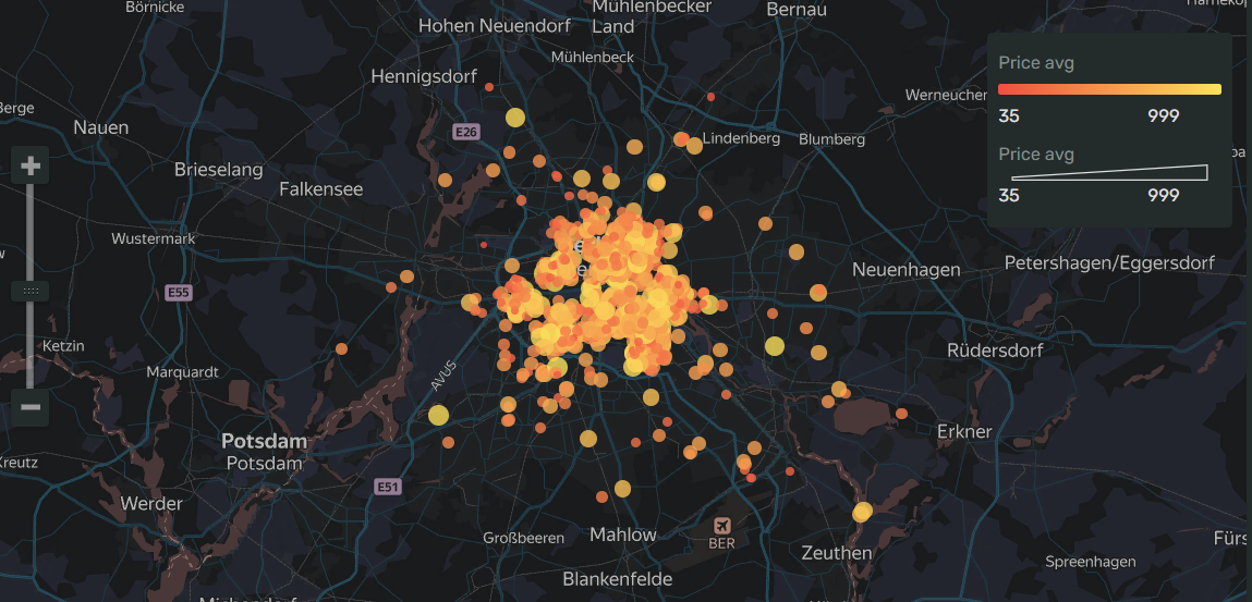
Points map
A points map plots separate points by their geographic coordinates.
The size of a point can indicate the value of a measure: the larger the point area, the higher the measure value.
Points may have different colors depending on the category they belong to. The color of a point can also indicate the value of a measure: the higher the value, the more saturated the point fill.

Use this map type to monitor value distribution across an area.
For example, you can plot the location of stores on a point map and highlight a group with a high profit.
AI-Insights not supported
This chart type doesn’t support the AI-Insights feature.
-
Open the All workbooks overview page and select your workbook.
-
Click Create → Wizard chart. You'll see the chart creation wizard.
-
On the top left, select the Dataset you want to visualize.
-
To add more layers, click + on the right of the layer selection field in the Layers slot.
You can drag and drop the layers in the drop-down menu to rearrange them - the higher layer will overlay the lower one.
Repeat the following steps to populate the slots independently for each layer:
-
Click the chart type field on the right of the dataset section and select Map from the drop-down menu, then choose Points (Geopoints) in the map type drop-down menu.
-
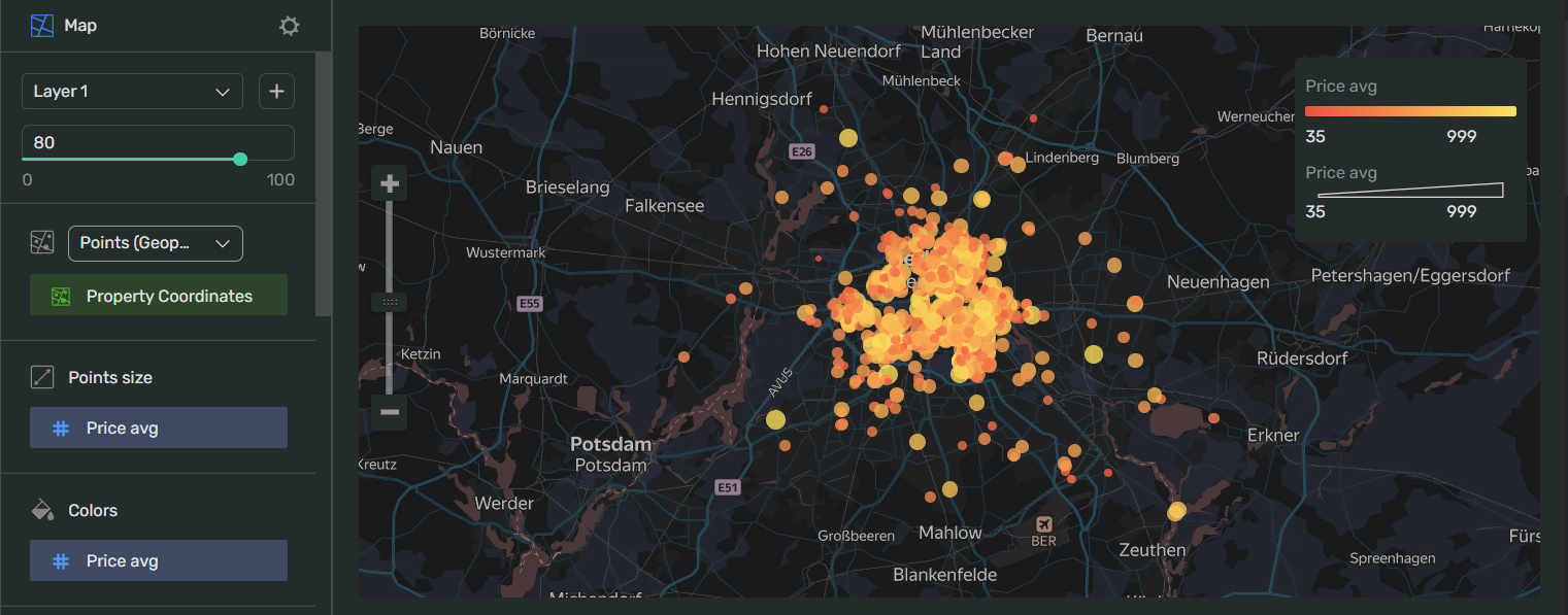
Drag and drop a measure to the appropriate sections of the chart (see the Data fields tab).
-
Set the size of the points displayed on the point map. Drag a measure to the Point size section.
-
Apply color to your points - crag a measure to the Colors section.
-
Drag the fields the values of which you want to display inside a tip on hover to the Tooltips section.
Your chart creation wizard should look similar to the following:

-
Click Save in the upper-right corner of the page.
-
Name your chart and click Done.
-
Choose the appropriate location for your chart by dragging it around the dashboard and resize it by dragging the lower-right corner of its frame.
-
Click Save in the upper-right corner of the page.
| Wizard slot | Description |
|---|---|
| Layers | Add and rearrange layers, specify the field for each slot below independently for each layer. |
| Points (Geopoints) | Dimension or Measure. Single-field slot. Must contain a geopoint. |
| Point size | Measure. Sets a point size depending on the measure value. |
| Colors | Dimension or Measure. Affects the saturation of point fill color. |
| Signatures | Measure. Overlays a text on a point. |
| Tooltips | Dimension or Measure. Displays the text from the fields in a tooltip over a point on hover. |
| Layer filters | Dimension or Measure. Used as a filter for the current layer. You can add a Measure Names or Measure Values field to this slot. |
| Chart filters | Dimension or Measure. Used to filter values. You can add a Measure Names or Measure Values field to this slot. |
To open data type settings, click the field type icon before the field name:
-
for
Integertype fields:Name
Description
Possible values
Name
Sets the name of the measure
A string of characters.
Type (Before aggregation)
Sets the field's data type.
Integer,Fractional number,String,Logical,Date,Date and timeAggregation
Applies a selected aggregation function to the data field.
No: doesn't apply aggregation. Count: applies the COUNT function, returns the total number of entries. Sum: applies the SUM function, returns the sum of all the field's values. Average: applies the AVG function, returns the arithmetic mean value. Minimum: applies the MIN function, returns the minimum value. Maximum: applies the MAX function, returns the maximum value. Count distinct: applies the COUNTD function to the data field and returns the number of unique values in the field.
Label
Displays labels with values on the chart.
Show,HideFormat
Sets the value display format
Number: display the values as plain numbers. Percent: show the values as a percentage.
Show delimiter
Toggles the separation of groups of thousands.
Show: display spaces between groups of thousands. Hide: hide spaces between groups of thousands.
Prefix
Sets a text to display before the value
A string of characters.
Postfix
Sets a text to display after the value.
A string of characters.
Units
Sets a rounding scale to apply to the field's values.
Null: don't apply rounding.Auto: select and apply a rounding scale automatically.Thousands, K: round to thousands, display000asK.Millions, M: round to millions, display000 000asM.Billions, B: round to billions, display000 000 000asB.Trillions, T: round to trillions, display000 000 000 000asT. -
for
Stringtype fields:Name
Description
Possible values
Name
Sets the name of the dimension
A string of characters.
Type
Sets the field's data type.
Integer,Fractional number,String,Logical,Date,Date and timeAggregation
Sets the aggregation type
No: doesn't apply aggregation. Count: applies the COUNT function to the data field and shows the number total number of entries. Count distinct: applies the COUNTD function to the data field and returns the number of unique values in the field.
-
for
Datetype fields:Name
Description
Possible values
Name
Sets the name of the dimension
A string of characters.
Type
Sets the field's data type.
Integer,Fractional number,String,Logical,Date,Date and timeGrouping
Sets the grouping and rounding by time period.
No - doesn't apply grouping. Rounding - rounds the values by
Year,Quarter,Month,WeekorDay. Date part - returns the number of a time period:Year,Quarter,Month,Week,Day of week, orDay.Date mode
Toggles the date display mode.
Continuous - display all the dates continuously. Discrete - show the dates containing values.
Aggregation
Applies a selected aggregation function to the data field.
No: doesn't apply aggregation. Count: applies the COUNT function, returns the total number of entries. Minimum: applies the MIN function, returns the minimum value. Maximum: applies the MAX function, returns the maximum value. Count distinct: applies the COUNTD function to the data field and returns the number of unique values in the field. Average: applies the AVG function, returns the arithmetic mean value.
-
for
Geodatatype fields:Name
Description
Possible values
Name
Sets the name of the data field
A string of characters.
Type
Sets the field's data type.
Integer,Fractional number,String,Logical,Date,Date and time,Geopoint,GeopolygonAggregation
Sets the aggregation type
No: doesn't apply aggregation. Count: applies the COUNT function to the data field and shows the total number of entries.
Column fill color
Fills the cells with different colors from a gradient depending on the value.
On: apply the color fill.Off: remove color fill.
To open chart settings, click
| Control | Default state | Description |
|---|---|---|
| Header | Off |
Displays the specified text in the centered line above the chart. |
| Legend | On |
Displays the dimension or measure and a color value gradient in a frame in the upper-right corner of the chart. |
After managing the controls, click Apply to see the results on the chart preview.
To open slot settings, click
Points size:
Under Minimal point size and Maximal point size, specify the range in which the size f point on the map will vary.
Colors:
- Gradient type toggles between gradients based on
2or3colors. - Drop-down menu selects the gradient color palette. The preview is displayed to the left.
- The button changes the gradient's direction.
- Threshold values allow you to specify threshold values manually, each value corresponds to a color.
-
We recommend using contrasting colors to visualize the values which the points on the map display.
-
If the points on the map are too dense, make them more transparent. This will help you see where they overlap.