Scatter chart
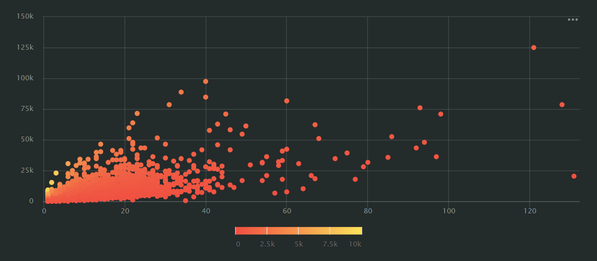
A scatter chart shows the relationship between two values (dimensions or measures) represented as points. A scatter chart always has two axes: it plots the values of one dimension or measure along the X-axis, and those of the other - along the Y-axis. A data point that links these two values shows at the intersection of the X and Y coordinates. These data points can arrange along the X-axis evenly or unevenly, depending on specific data.
For example, you can use this chart type to show the relationship between the average order value and the number of orders for a product.

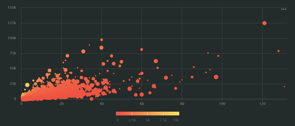
You can also represent dependencies on a scatter chart using point sizes. The size of a point depends on the measure value: the higher the value, the larger the point size.

For example, the size of a point may depend on the discount on a product.
AI-Insights supported
Use the AI-Insights feature with this chart type.
-
Open the All workbooks overview page and select your workbook.
-
Click Create → Wizard chart. You'll see the chart creation wizard.
-
On the top left, select the Dataset you want to visualize.
-
Click the chart type field on the right of the dataset section and select Scatter chart from the drop-down menu.
-
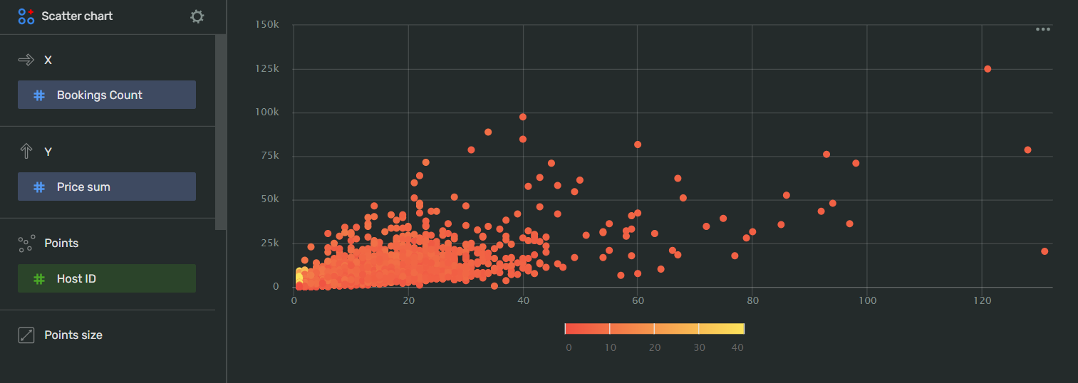
Drag and drop Measures and Dimensions to the appropriate sections of the chart (see the Data fields tab).
Your chart creation wizard should look similar to the following:

-
Click Save in the upper-right corner of the page.
-
Name your chart and click Done.
-
Choose the appropriate location for your chart by dragging it around the dashboard and resize it by dragging the lower-right corner of its frame.
-
Click Save in the upper-right corner of the page.
Note
This configuration is a segment in the overall description of Visualization assets in the workbook. For the complete tutorial, see Use Visualization API.
To describe a scatter chart, use the ScatterPlot configuration:
-
name- your chart's name. Must be unique within the workbook. -
dataset- the ID of the dataset whose data to visualize. -
ad_hoc_fields- (optional) describe the calculated fields to use in the chart:-
title: the field's title. -
id- the ID of the calculated field. Must be unique within the dataset. -
cast- the field's Visualization-specific data type -
description- (optional) the field's description in plain text format. -
hidden- (optional) iftrue, doesn't the field in the dataset's field list. If unspecified, defaults tofalse. -
aggregation- applies aggregation to the field. -
calc_spec- defines the data field specification.
-
-
visualization- describe the configuration of your chart:-
kind: scatter_plot- specify the chart type. -
columns- configure the data reference for columns-
source- specify the data source:-
kind: ref- take the data from the reference data source. This is the dataset specified above. -
id- specify the ID of the data field from the dataset whose data will be used to visualize the Y axis.
-
-
-
rows- configure the data reference for rows:-
source- specify the data source:-
kind: ref- take the data from the reference data source. This is the dataset specified above. -
id- specify the ID of the data field from the dataset whose data will be used to visualize is the X axis.
-
-
-
measures- configure the data reference for measures:-
source- specify the data source:-
kind: ref- take the data from the reference data source. This is the dataset specified above. -
id- specify the ID of the data field from the dataset whose data will be used to visualize is the X axis.
-
-
-
sort- specify the data field to be used as a sorting reference:-
source- specify the data source:-
kind: ref- take the data from the reference data source. This is the dataset specified above. -
id- specify the ID of the data field from the dataset whose data to use as sorting reference.
-
-
direction- configure the sorting direction to apply to the chart. You can assignASCfor ascending orDESCfor descending.
-
-
coloring(optional):-
kind- specify which data type field to use as a color filter. You can specifya dimensionormeasure. -
source- specify the data source:-
kind: ref- take the data from the reference data source. This is the dataset specified above. -
id- specify the ID of the data field from the dataset whose data will be used as a color filter.
-
-
palette_id- select the palette to apply to the chart. For most cases, usedefault-palette. -
mounts- assign colors from the palette to data points from the source:-
value- specify the exact value from thesource. -
color_idx- match the above value to a color swatch number in the palette.
-
-
-
API example
- name: ch_pivot_sum_sales_per_cat_seg_y
chart:
   datasets:
   - ds_sales
   ad_hoc_fields:
   - field:
      title: The order_year
      id: order_year
      cast: date
      description: null
      hidden: false
      aggregation: none
      calc_spec:
         kind: id_formula
         formula: DATETRUNC([date], 'year')
   visualization:
      kind: pivot_table
      columns:
      - source:
         kind: ref
         id: category
      rows:
      - source:
         kind: ref
         id: order_year
      - source:
         kind: ref
         id: segment
      measures:
      - source:
         kind: ref
         id: sum_sales
      sort:
      - source:
         kind: ref
         id: order_year
      direction: DESC
      coloring: null
| Wizard slot | Description |
|---|---|
| X | Dimension or Measure. Sets the value of the x-axis. |
| Y | Dimension or Measure. Sets the value of the y-axis. |
| Points | Dimension. Defines the number of points on the chart. |
| Points size | Dimension or Measure. Defines the relative point size. |
| Colors | Dimension. Affects point colors. |
| Sorting | Dimension or Measure. Affects the sorting of points. |
| Chart filters | Dimension or Measure. Used to filter values. You can add a Measure Names or Measure Values field to this slot. |
To open data type settings, click the field type icon before the field name:
-
for
Integertype fields:Name
Description
Possible values
Name
Sets the name of the measure
A string of characters.
Type (Before aggregation)
Sets the field's data type.
Integer,Fractional number,String,Logical,Date,Date and timeAggregation
Applies a selected aggregation function to the data field.
No: doesn't apply aggregation. Count: applies the COUNT function, returns the total number of entries. Sum: applies the SUM function, returns the sum of all the field's values. Average: applies the AVG function, returns the arithmetic mean value. Minimum: applies the MIN function, returns the minimum value. Maximum: applies the MAX function, returns the maximum value. Count distinct: applies the COUNTD function to the data field and returns the number of unique values in the field.
Label
Displays labels with values on the chart.
Show,HideFormat
Sets the value display format
Number: display the values as plain numbers. Percent: show the values as a percentage.
Show delimiter
Toggles the separation of groups of thousands.
Show: display spaces between groups of thousands. Hide: hide spaces between groups of thousands.
Prefix
Sets a text to display before the value
A string of characters.
Postfix
Sets a text to display after the value.
A string of characters.
Units
Sets a rounding scale to apply to the field's values.
Null: don't apply rounding.Auto: select and apply a rounding scale automatically.Thousands, K: round to thousands, display000asK.Millions, M: round to millions, display000 000asM.Billions, B: round to billions, display000 000 000asB.Trillions, T: round to trillions, display000 000 000 000asT. -
for
Stringtype fields:Name
Description
Possible values
Name
Sets the name of the dimension
A string of characters.
Type
Sets the field's data type.
Integer,Fractional number,String,Logical,Date,Date and timeAggregation
Sets the aggregation type
No: doesn't apply aggregation. Count: applies the COUNT function to the data field and shows the number total number of entries. Count distinct: applies the COUNTD function to the data field and returns the number of unique values in the field.
-
for
Datetype fields:Name
Description
Possible values
Name
Sets the name of the dimension
A string of characters.
Type
Sets the field's data type.
Integer,Fractional number,String,Logical,Date,Date and timeGrouping
Sets the grouping and rounding by time period.
No - doesn't apply grouping. Rounding - rounds the values by
Year,Quarter,Month,WeekorDay. Date part - returns the number of a time period:Year,Quarter,Month,Week,Day of week, orDay.Date mode
Toggles the date display mode.
Continuous - display all the dates continuously. Discrete - show the dates containing values.
Aggregation
Applies a selected aggregation function to the data field.
No: doesn't apply aggregation. Count: applies the COUNT function, returns the total number of entries. Minimum: applies the MIN function, returns the minimum value. Maximum: applies the MAX function, returns the maximum value. Count distinct: applies the COUNTD function to the data field and returns the number of unique values in the field. Average: applies the AVG function, returns the arithmetic mean value.
-
Geodatatype fields aren't supported by this chart type.
To open chart settings, click
| Control | Default state | Description |
|---|---|---|
| Header | Off |
Displays the specified text in the centered line above the chart. |
| Legend | On |
Displays the field name associated with color line below the chart. |
After managing the controls, click Apply to see the results on the chart preview.
To open slot settings, click
X and Y axes:
| Setting | Description | Possible values |
|---|---|---|
| Axis title | Sets an axis label. | Auto: Uses a field name. If the section contains several fields, Visualization uses the name of the field added to the list first. Manual: Allows you to enter an axis title manually. Off: Axis will have no label. |
| Axis type | Sets the axis type. The setting is available for fields in the axis section that have the Fractional number type. | Linear: Sets a linear axis type. Logarithmic: Sets a logarithmic axis type, preferable for charts with a wide range of values. A logarithmic axis allows you to display a fast-growing graph in a convenient form for analysis, reducing values by order of magnitude. |
| Grid | Displays a grid on the chart. | On: Displays the grid.Off: Hides the grid. |
| Grid step | Sets the grid spacing in pixels. | Auto: Sets the grid size automatically. Manual: Allows you to set the grid size in pixels. |
| Labels | Displays data field labels on the chart. | On: Displays labels.Off: Hides labels |
| Labels view | Sets the appearance of the label display. The setting is available if the Labels setting is set to On. |
Auto: Positions label values automatically. Horizontal: Positions label values horizontally. Vertical: Positions label values vertically. Angle: Displays label values at a 45-degree angle. |
| Empty values (null) | Specifies how to process empty values. Not supported by Scatter chart. |
Ignore: Doesn't display empty values in a chart. Connect: Joins values of fields that have empty values between them. Display as 0: Displays empty values in charts as zero (0) field values. |
| Scaling | Sets the scale of chart axes. | Auto: Sets the scale automatically. You can specify how Visualization sets the scale: from the minimum to the maximum field values (Autoscale from min to max) or from 0 to the maximum field value (Autoscale from 0 to max). Manually: Allows you to set the axis scale manually. You can set the maximum and minimum values along the axis. Visualization trims the chart lines by this value. |
Colors:
On the left, you can select a line from a data source in the Colors slot of your chart.
On the right, you can select a color scheme and a color for the line. Select AUTO to let Visualization do the coloring for you.
Point size:
Allows you to customize the minimum and maximum point sizes:
| Setting | Description |
|---|---|
| Point size | Determines the point size in pixels. |
-
We don't recommend using a scatter chart to visualize a progression of a measure over time.
-
To display the values for each data point, drag Measure values to the Signatures section.