
The importance of accurate (and useful) data visualization
Why visualising your data correctly is so important when looking for actionable business intelligence
DoubleCloud talks a lot about our Managed Services for ClickHouse® and Apache Kafka® but what we wanted to talk to you about today was how important visualising your data is to garner actionable business intelligence and… of course… our free visualization tool.
We offer our users a wide variety of different data visualisation options to help look for meaning in their data and, given the large amounts of it they often have to deal with, portraying it both correctly and in a useful fashion, is vital, if not business critical.
If a user can’t tell at a glance what their data’s saying then are they, in fact, any better off than looking at it in its raw form?
Accurate and efficient data visualisations have to be considered the core to any modern data stack and analytics platform.
Now, what’s interesting is that the guiding principles to ‘good’ data visualization haven’t really changed at all in the last few decades. What has changed however is the tech powering them, the amount of data that can help form them and the ease in which said data can be displayed in a multitude of different ways.
The problem with so many different options however is that sometimes your data may be displayed in a way that’s not quite right, or certainly not the best or most efficient way it can be displayed.
Display it ‘wrong’ and the resulting chart may actually end up misleading your end users.
That’s why today, we’re talking through our free data visualization tool, what the best ways to display differing data sets are and how to select the right data visualization for the right task.
Line Charts
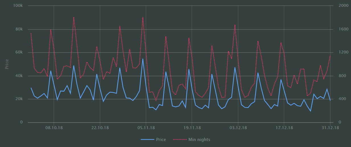
Line Charts had to be first, didn’t they?
They’re one of the easiest to read, most instantly recognisable, and probably one of the simplest data visualization representations to put together (at least manually).
Data trends can be identified at a glance (up or down) measured against another metric (usually time), with different subsets of data being represented by differing coloured lines.
Data is typically displayed over two axes with them at their most effective when displaying data over a time period be it, seasonality or a ratio of multiple measures at a single point in time.
However, this simplification of data trends can sometimes be a line charts downfall, as complicated, underlying trends will often be missed at this level.
Stacked Area Charts
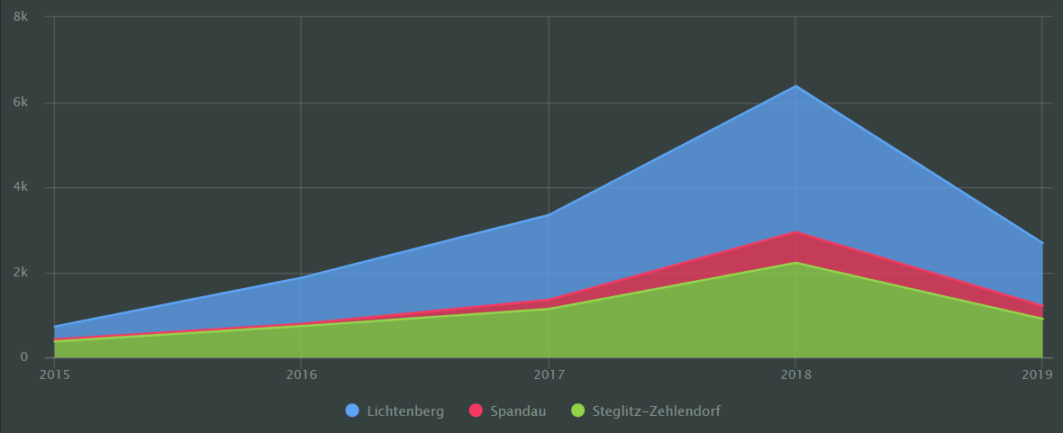
Stepping up from the humble line chart is the Stacked Area Chart, showing how a single or multiple measure changes over time.
The area between the axis and the line is filled with colour to indicate volume so if multiple data categories are displayed, they overlap with the top line represents the sum of all the measures.
Normalized Stacked Area Charts
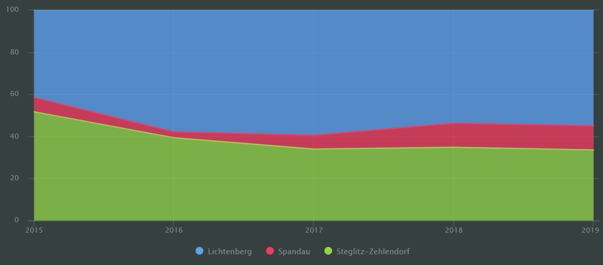
Following on from the stacked area chart is the normalized stack area chart and, whilst they might both seem (and look) similar, there’s an importance difference.
Unlike a regular stacked area chart, a normalized stack area chart can show changes to the contribution of each category, measured over a particular time interval.
It can then highlight different areas using different colours, locating them above each other, showing the percentage of areas rather than their absolute value.
Column Charts
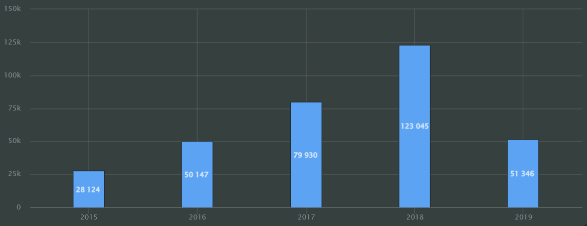
Another instantly recognisable chart is, of course, the column chart.
Column charts are used to display values of one (or more) measurements by either period or category.
On a column chart, the height of the column will reflect the measured value (s), so the higher the column… the higher the value.
Column charts are particularly useful if you want to put an emphasis on a measures individual value rather than any general trends.
We didn’t stop there though.
Within DoubleCloud’s free column chart visualization, two other sub‑types can also be used.
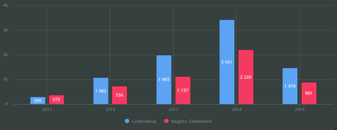
Grouped Column Charts
Very similar to the standard column chart, a grouped column chart, as shown below, is great at showing two or more measures, with the height of the column once again being used to display, compare and contrast the different measures.
Stacked Column Chart
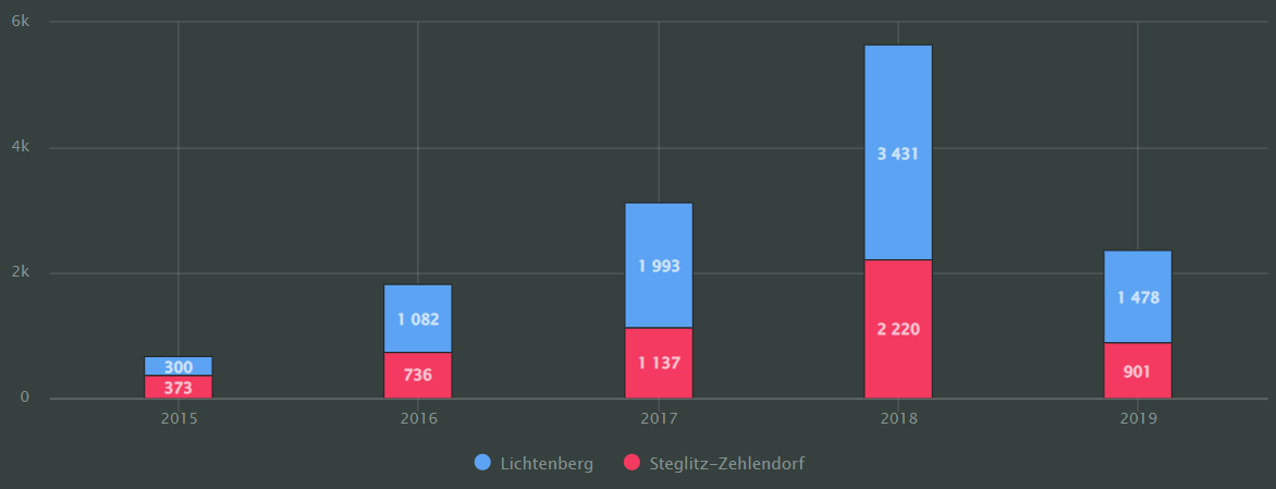
The last of the column charts in our free visualization tool is the stacked column chart.
These are used to show the ratio of internal segments as measured by period.
Segments are stacked on top of the other within individual columns with the base of each following segment as the top boundary of the previous…
Normalized Column Charts
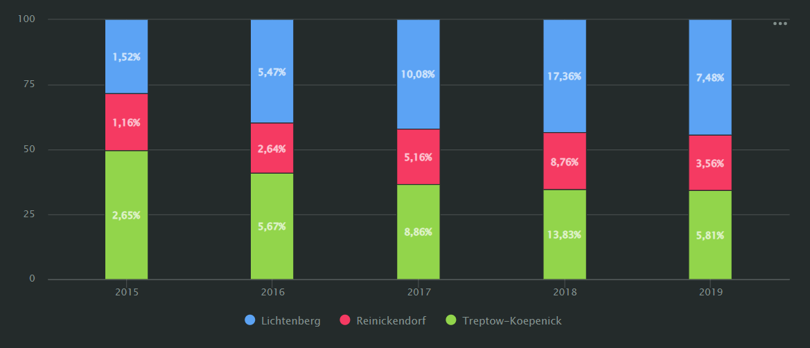
Following on from our column charts, DoubleCloud also offers all our clients normalized column charts as part of our free data visualization tool.
Normalized column charts are used by data analysts and data scientists to show the contribution of each measure or category to the total amount.
Within these charts, segments all have different colours and stack one on top of the other, with the height of a segment indicating its ratio to the total value.
Combined Charts
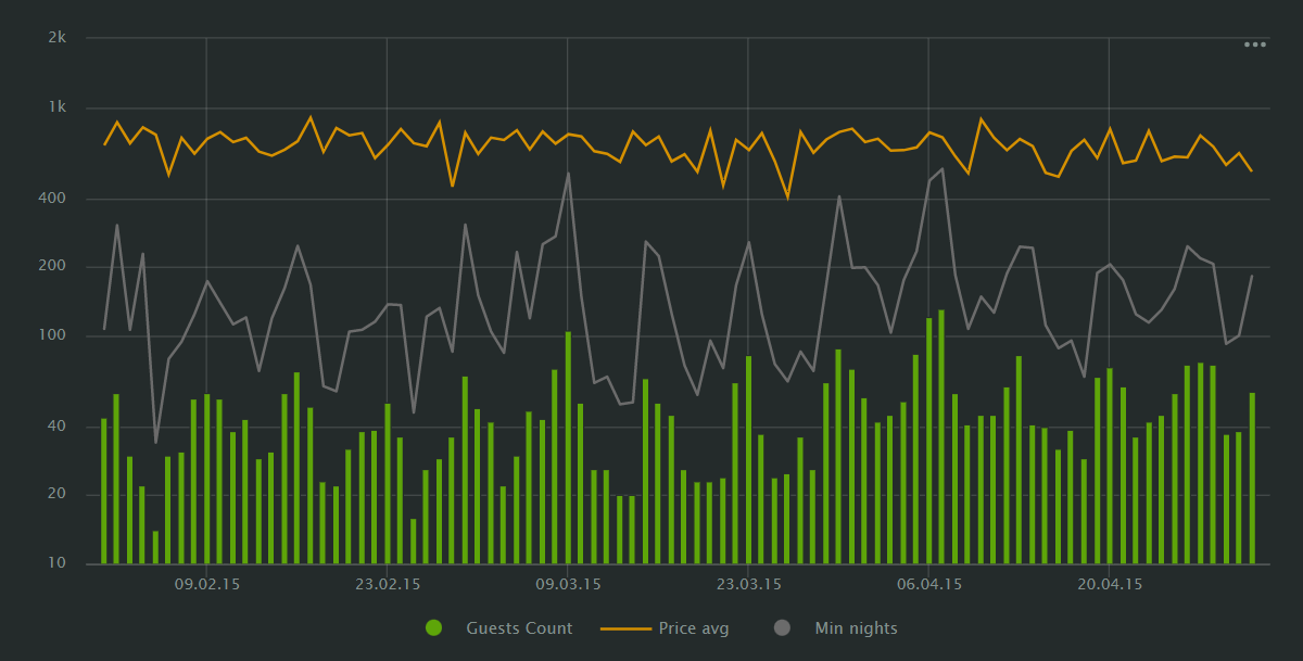
Exactly as it sounds, a combined chart ‘combines’ many of the previous charts into a multiple data display visualization all within the same chart for ease of use.
That allows users to compare multiple data streams, all within one visualization.
This is incredibly useful when a lot of data needs to be represented in one chart, but can on occasion appear ‘busy’, necessitating separate charts for clarity.
Bar Charts
Much like column charts, bar charts display the measure of one or multiple measures by category… except this time displayed horizontally, with the length of a bar representing the measure value… the longer the bar, the larger the value.
Take away all the different colours, curves, gradients, angles or shapes of other display methods, and a simple bar chart is nearly unparalleled for showing off relative sizes of categorical data at a glance (e.g., sales by district).
The biggest bonus to a bar chart is that they can be understood by virtually anyone without any specialist understanding of the data being displayed or the need for a key at the side of the graph explaining what everything means.
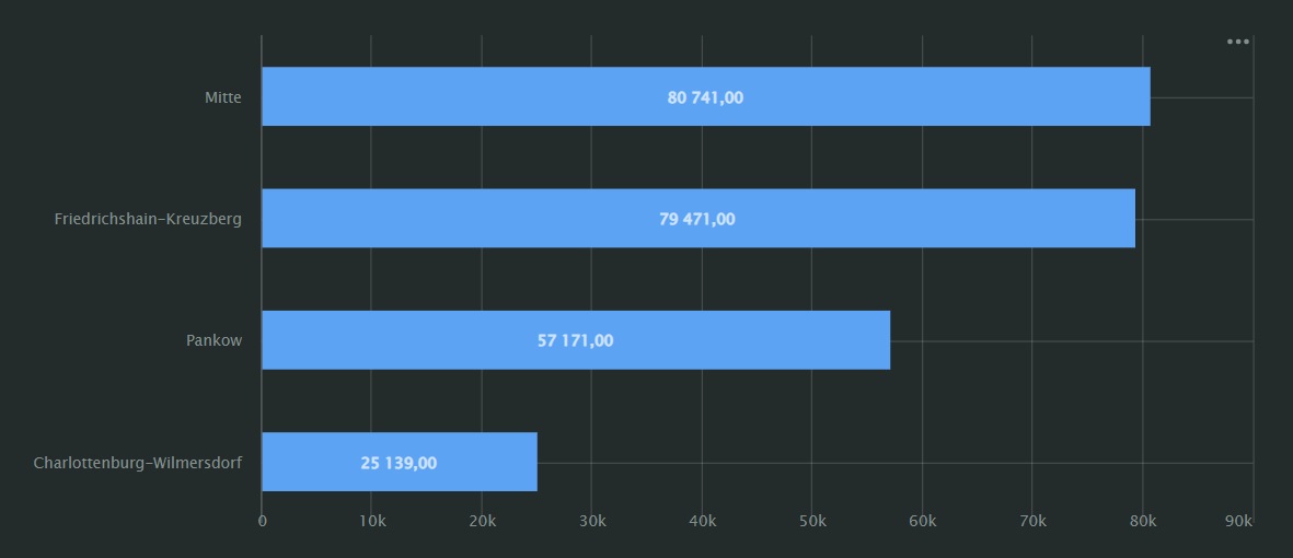
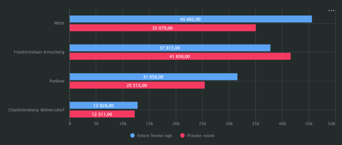
As with column charts, DoubleCloud offers two sub‑types our users can utilise for free.
Grouped Bar Charts
Again, a grouped bar chart will allow you to compare multiple measures, with the bar representing the measure value.
Stacked Bar Charts
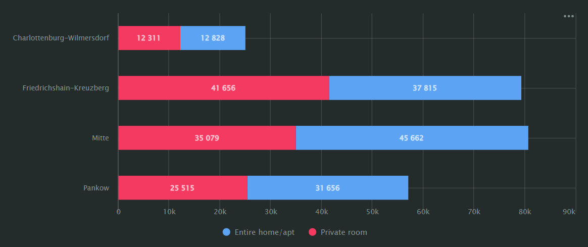
Stacked Bar Charts are great to show the ratio of internal segments by periods with segments stacking one after the other.
Similar to our bar charts, the starting point of each segment is the right boundary of the previous.
Normalized Bar Charts
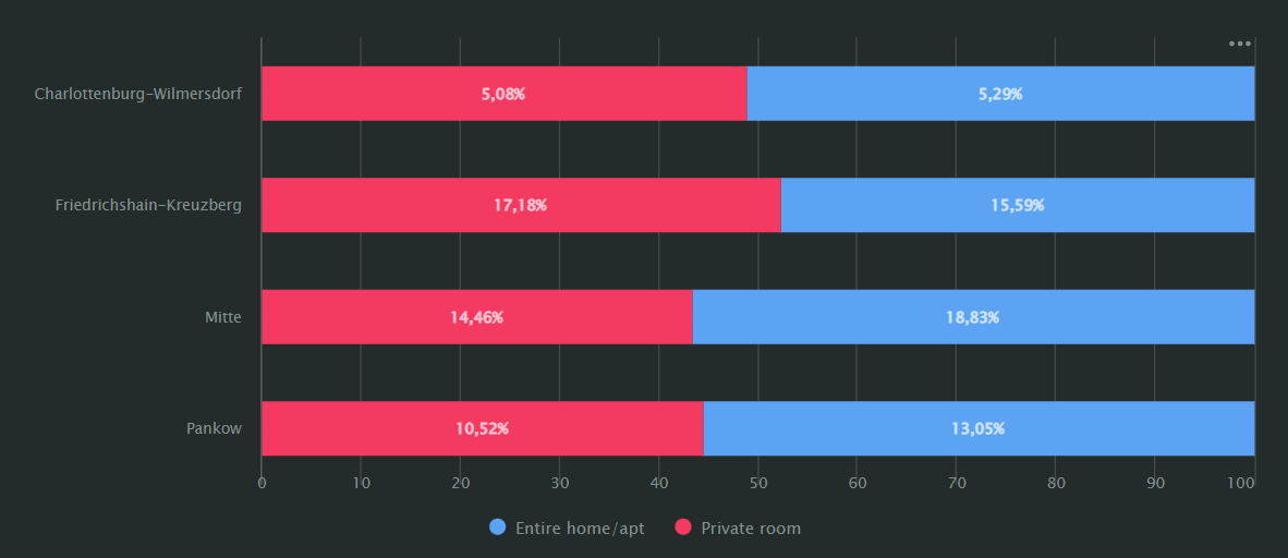
Normalized Bar Charts are typically used when a data analyst wants to present their data as a percentage of multiple measures in the total amount, either by period or category… again as horizontal bars.
DoubleCloud’s visualization tool arranges the different segments by colour, one after the other with the length of a segment indicative of its ratio to the total amount.
Scatter Charts
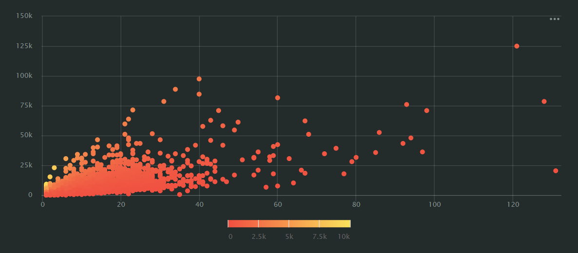
Scatter Charts, sometimes also known as scatter plots, scatter graphs or scattergrams, are used to display the relationships and general density between two different values (dimensions or measures), which are represented on the chart as points.
They’ll always have two axes: the value of one dimension or value along the X-axis and the other on the Y-axis.
Data points that link these two values are plotted at the intersection of the X and Y coordinates.
Scatter Charts are great for showing density of data and highlighting trends you may not have been aware of before, as well as outliers you may not have considered outliers in an incredibly easy to read manner.
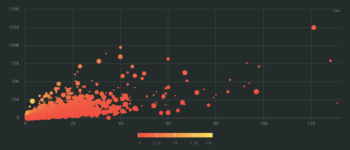
Dependencies can also be represented on a scatter chart using different point sizes with the size of a point depending on the measure value (the higher the value, the larger the point size) as shown below.
Pie Charts
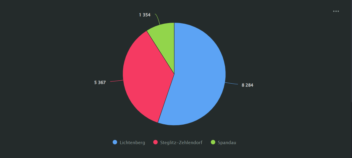
Want to represent subsets of your data as a percentage of the whole? Then you’re looking for the humble pie chart!
Displayed as a circle divided up into different coloured segments to illustrate the relative percentage size of those said segments, the pie chart is a great tool in reporting ‘top-line’ concepts.
However, a lot of data visualisation experts agree that people often struggle to take away a truly detailed picture of the data from just a pie chart, especially if differing slices are close in size.
With the entire circle representing the sum total of all your data categories, a pie chart is the go-to tool for highlighting information at a glance but if a more granular approach is needed there are other visualizations we offer that may be better choices.
Donut Charts
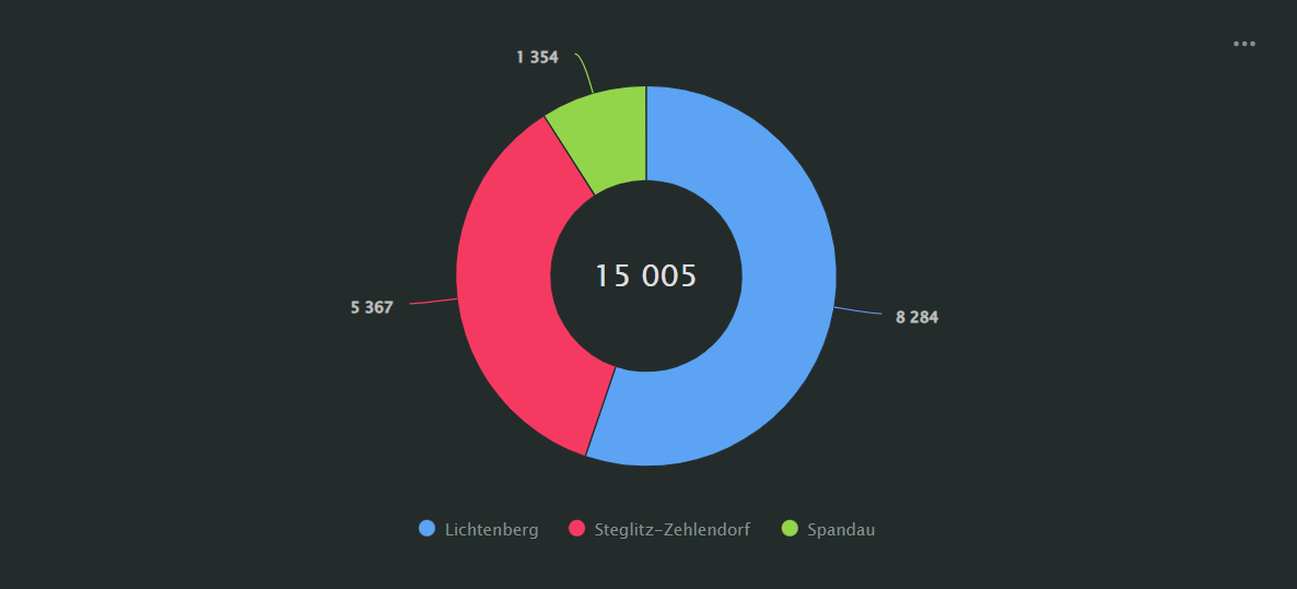
It shouldn’t be a surprise, given its shape, to learn that a donut chart is used in much the same manner as a pie chart.
Rather than a solid circle, it displays data in a ring formation that gets divided into sectors to illustrate a proportion of elements with the total number being represented in the center.
As with the pie chart, the total size of each segment relates to its percentage of the whole, whilst the figure in the centre is dependent on the measure selected.
Tree Charts
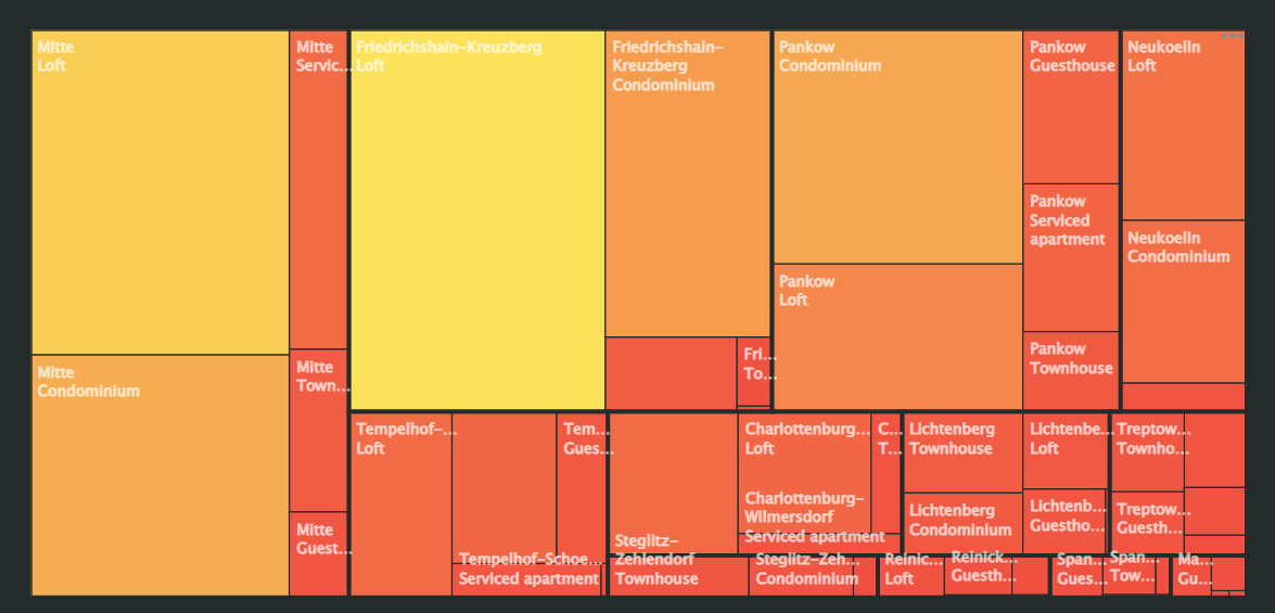
Moving away from the more ‘simple’ visualizations now, we come to the tree chart, also sometimes referred to as a tree map.
These charts (again, all part of our standard free data visualization tool) display a hierarchy of data as a set of nested rectangles.
Within a tree chart, each hierarchy level will correspond to a different dimension that’s displayed as a coloured rectangle with nested rectangles (see below).
Data is represented by the relative size of the rectangle, dependent on its measure value.
The higher the value… the larger the rectangle.
Tree Charts are often used to represent sales data as they can capture the relative sizes of different data categories really well, allowing users to quickly recognise contributors to each category.
QL Charts
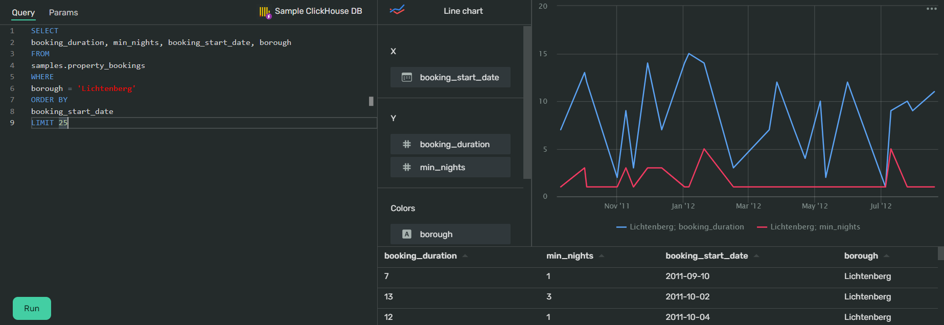
QL Charts are massively versatile, allowing you to visualize data directly from source databases in its native SQL form, thus reducing database workloads by utilizing direct queries.
QL charts send SQL queries through the connection to the source database without any need for an intermediate dataset from DoubleCloud.
Using our free data visualization tool you can create QL Charts for line charts, stacked area charts, normalized stack area charts, column charts, normalized column charts, bar charts, normalized bar charts, pie charts, indicators and tables.
Points Map
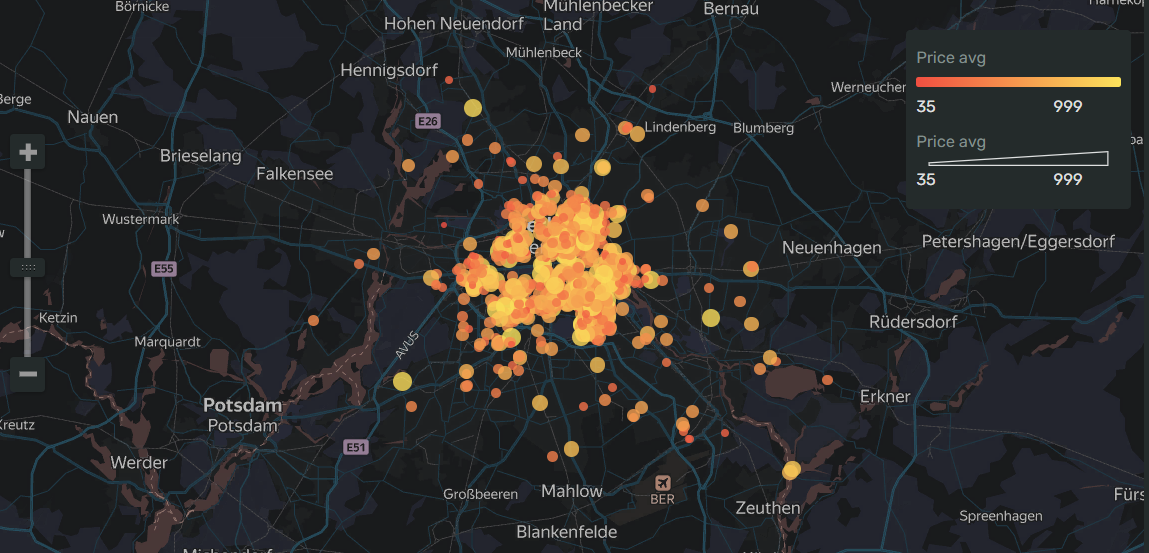
Another visualization with a clue built right into the name; points maps are used to plot separate points by their geographic coordinates on… a map.
To offer more useful insight at a glance, it’s typical that the size of the ‘point’ will give an indication as to the value of the measure… the bigger the point, the higher the measure.
It’s also quite common for different points on a map to have differing colours, depending on the data category they’re representing.
The colour of a point however can also indicate the value of a measure; for instance the higher a value, the more saturated a point fill becomes.
Point Maps With Clusters
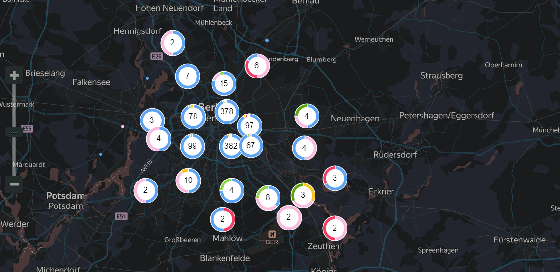
Unlike regular point maps, a point map with clusters, clusters adjacent points together.
That means a cluster will appear on a map represented as a mini‑donut chart with the number of points displayed in the centre.
When using a points map with clusters it’s important to note that behaviour of points will vary depending on the scale of the map and that, when scaling down, points clusters will automatically cluster together.
Of course, that also means that when scaling your map up, the distance between points will increase and clusters will automatically be split into smaller clusters and / or their individual points.
Point maps with clusters are particularly useful when you want to visualise a point map with a lot of points on it, with the clusters offering much needed extra clarity.
Heat Maps
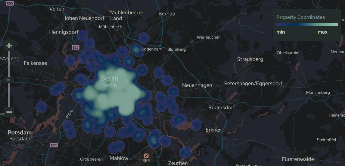
Continuing on with our ‘map trend’, heat maps should be used when you want to represent the density of point distribution as a coloured graphic overlayed over a map, with colour gradients ranging from green to red representing said density.
The more points in the area… the closer it comes to red.
Heat maps are at their most effective when using datasets that contain a high density of points over a relatively small geographic area.
They’re also great at highlighting (and sometimes discovering) dependencies that might not have been clear on a regular points map due to too much overlap.
Tables
Of course, sometimes it’s perfectly fine not to over complicate things.
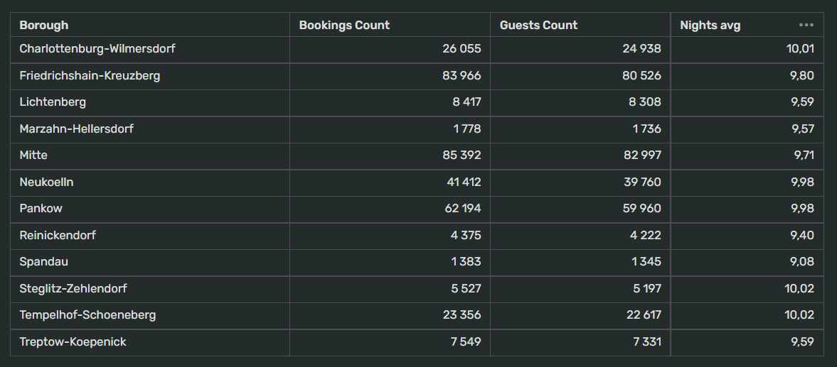
Displaying data in a tabular format, with a header row to define field names and all the rest displaying their vales is perfectly fine.
Tables tore data as 2D arrays, consisting of columns and rows.
Column headers show dimensions or measure names, with their values in individual cells. Each row is then a set of cells with a value for each column.
Tables are great for data analysis of large numbers of figures but… they’re not great at offering any insights at a glance as compared to any of the above graphic based visualizations.
Where they’re best utilised is for quantitative comparisons, where different values of multiple categories or dimensions can be seen.
You can add linear indicators to columns to visualize numbers, effectively creating a bat chart within a table column.
Pivot Tables
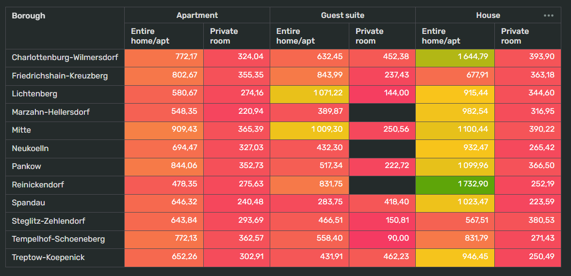
Pivot tables, much like regular tables, display data in tabular form, with rows and columns containing source values and individual cells at their intersections holding the correct values.
Pivot tables are a fantastic tool for working with huge data sets, allowing you to easily analyze relationships between different measures but again, all down at being able to offer insights at a glance.
Indicators
Finally we come to the last of our current free visualization tools… indicators.
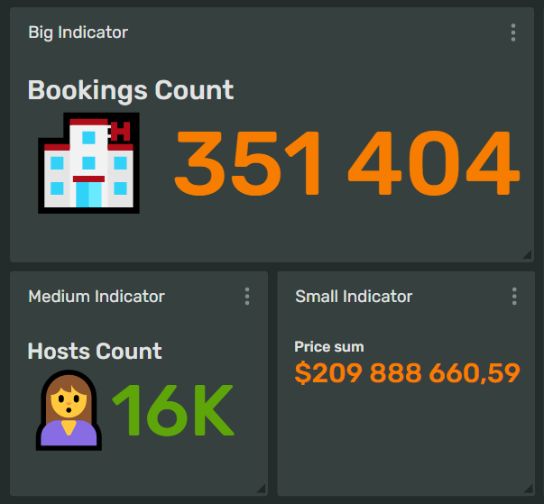
Indicators are used, as you can see below, to display an individual number that deserves particular prominence.
Typically, DoubleCloud’s clients would use this visualization to display total revenue, visitors per year, total traffic over a particular period etc, etc.
ClickHouse is a trademark of ClickHouse, Inc. https://clickhouse.com
Apache® and Apache Kafka® are either registered trademarks or trademarks of the Apache Software Foundation in the United States and/or other countries.
In this article, we’ll talk about:
Start your trial today


