QL charts
A QL chart allows you to visualize data directly from your source database in its native SQL flavor. It reduces database workload by using direct queries.
This chart type sends SQL queries through the connection to the source database without an intermediate dataset on the DoubleCloud side.

You can create a QL chart for the following chart types:
- Line chart
- Stacked area chart
- Normalized stacked area chart
- Column chart
- Normalized column chart
- Bar chart
- Normalized bar chart
- Pie chart
- Indicator
- Table
AI-Insights supported
Use the AI-Insights feature with this chart type.
-
Open the All workbooks overview page and select your workbook.
-
Under Connections, open the information page of the connection through which you want to send SQL queries to your source database.
-
Under Raw SQL level, select Allow subselects in datasets and queries from charts.
-
Click Save changes.
-
-
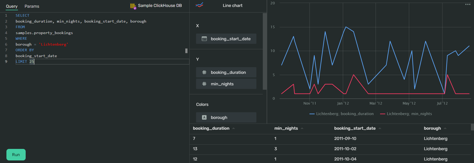
Click Create → QL Chart. You'll see the chart creation interface. It consists of two main sections:
-
Query section. Here you can write the SQL query you want to visualize. You can use the Formula syntax page for reference.
-
Chart and dataset preview section. Here you can select the chart type you want to apply to your visualization.
Below the chart preview, you'll see the data table consisting of all the data received from the source database via the SQL query.
-
-
In the query section, under Select connection to start, click Select. Choose the connection to the database you want to visualize.
-
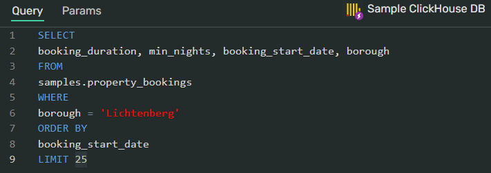
Write a query for the data visualization:

Tip
In this section, DoubleCloud Visualization uses a live suggestions engine to accelerate and simplify query writing.
-
In the chart and dataset preview section, click the chart type to select the visualization suitable for your data (line chart by default).
-
Click Run to see the chart preview with the visualized data from the query.
-
Click Save in the upper-right corner of the page.
Data fields displayed in the limited chart wizard depend on the chart type selected for visualization.
You can drag and drop the fields between slots to change the visualization.
This chart type supports the following basic SQL commands:
-
SELECT -
FROM -
WHERE -
GROUP BY -
ORDER BY
Query example for ClickHouse®
SELECT
<column_name_1>, <column_name_2>, <column_name_3> -- specify the columns
FROM
<database_name>.<table_name> -- the name of the database and table with the columns above
WHERE
<column_name_2> = '<the contents of a cell>' -- use this as a filter
ORDER BY
<column_name_3> -- the X axis will use the data from this column for its coordinates
-
You can't use this chart type to create pivot tables.
-
You can't use this chart type to visualize data on map charts (points map, points map with clusters, and heat map).
-
You can't create calculated fields with this chart type.