Dashboard
Dashboard is a page with multiple tabs that contain charts. You can organize the added charts into logical groups on separate tabs.
This section contains information about charts, selectors and links.
Visualization lets you display the dashboard in full-screen mode. This mode hides certain interface elements and expands the data visualization area.
Charts
A Chart is the main dashboard element. You can place charts on the dashboard and resize them.
Visualization allows you to create display such visualization elements as charts, tables, maps and indicators.
You can create links between all kinds of charts and selectors.
Chart inspector
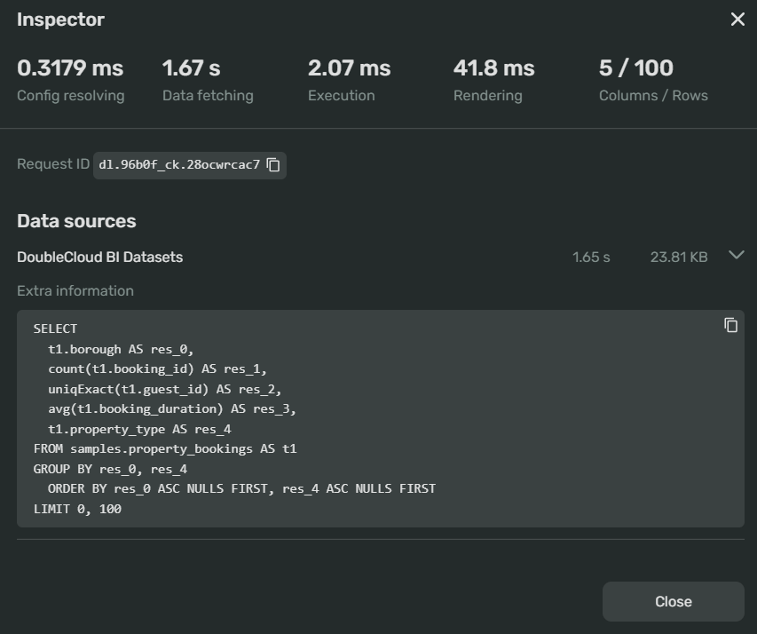
An inspector is a tool that allows you to diagnose issues with data processing and rendering in your chart:

You can use it to detect the reasons behind slow loading or updating of a chart. It's also designed to help optimize data fetching and rendering speeds.
The upper section of the inspector window displays the timing readouts for the main chart operations:
-
Config resolving - the chart configuration loading time
-
Data fetching - the time it took to load the data from the source database
-
Execution - the time it took to process the data fetched from the source database
-
Rendering - the time it took to generate the visualization in the chart.
Inspectors for some chart types have additional readouts:
- Lines/Rows - the number of lines and rows for a table.
If you have readouts exceeding recommended levels, they'll be colored orange (moderate) or red (severe).
You can get advice from the system on how to optimize the exceeding parameter by clicking the ? button next to a colored readout.
Below the readouts, you'll find the RequestID that you can use to help out technical support troubleshoot your chart.
Under Data sources, you'll find:
-
The name of the data source
-
The code of the SQL query sent to the source to render the visualization for the chart.
Note
Note that a chart inspector doesn't display an SQL query for QL charts.
Widgets
You can create and place the following widgets onto your dashboards:
Selectors
Selector is a filter that manipulates query results of charts linked to it. You can link a selector to a chart or another selector.
Note
A selector works only within the tab it's placed on.
Text
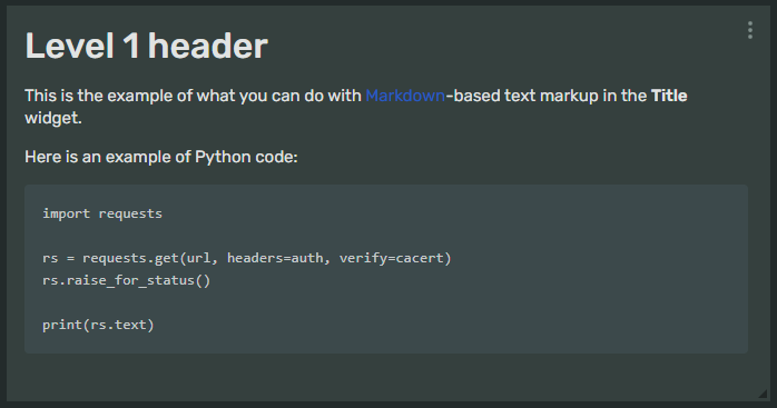
The Text widget displays, for example, links, tables, images, or explanations on your dashboards. It supports the Markdown markup language:

For more information on how to use Markdown in Visualization, see Visualization Markdown syntax.
Title
The Title widget is a heading to make your dashboards easier to read. With this widget, you can segment and organize your charts into groups within tabs or a single dashboard page:

You can select the font size of your title: Large, Medium, Small or XSmall.
Links
Link determines the way a selector affects one or more charts or other selectors. Selectors are linked with charts created within the same dashboard.
For example, if you select a country in the first selector on the dashboard, the linked one limits the list of values to the cities in this country (and vice versa).
To determine how values in selectors and charts are filtered, use the Links window in dashboard edit mode.
You can use the following types of links for a pair of visualization elements (charts and selectors):
-
Link: both elements affect each other. -
Incoming link: the element that has this link type affects the linked element one-way. -
Outgoing link: the element that has this link type is affected by the linked element one-way. -
Ignore: both elements in a pair mutually ignore each other. -
No link: elements from different datasets or elements that can't be linked.
You can see possible link types for elements in the following table:
| Combinations | Selector | Chart |
|---|---|---|
| Selector | LinkIncoming linkOutgoing linkIgnore |
Outgoing linkIgnore |
| Chart | Incoming linkIgnore |
No link |
Table of contents
The Table of contents helps you navigate through complex dashboards. It has the following structure:
Contents
├─ Tab 1 # Every dashboard has at least one tab
│  ├─ Title 1 # These are Title widgets with Display in contents box checked
│  └─ Title 2, etc.
└─ Tab 2, etc # If you decide to put more than one tab on your dashboard
You can display the table of contents on the left of your dashboard page.