Business intelligence best practices: 10 things you must know
Business intelligence means analyzing business data to extract insights that are helpful in decision-making. Since the rise of big data, organizations have been spending heavily on business intelligence tools. Resultantly, the global business intelligence software market is valued at $25.73 billion in 2023, and it will be $34.16 billion in 2028, growing at a CAGR of 5.83%.
But unfortunately, 60% of the investment in data analytics goes to waste because insights obtained were never used in decision-making. So, it becomes essential for organizations to learn business intelligence best practices. Best practices help organizations gain a competitive edge.
What is a BI dashboard, and why use one?
A BI dashboard is a tool that connects with various business data sources and enables users to create customized visualizations. Users perform BI reporting to extract insights from the data.
It displays all businesses’ key performance indicators in one place, which helps in decision-making. BI reporting is done for two main reasons:
1) Regular Reporting: Regular reporting has standardized insights. It provides insights such as daily sales volume.
2) Ad-hoc Reporting: Customized research is required if the business wants an answer to a particular business problem. The data analyst analyzes data to find answers to specific questions, such as Why did sales drop on the weekend?
It is essential to follow best practices because only 27% of executives believe that their BI investments were helpful in decision-making.
The roadmap for business intelligence best practices is as follows:
1. Understand the business requirements
Understanding the needs and expectations of key stakeholders is crucial in business intelligence reporting. Understanding business requirements involves the exploration of business processes.
It’s important to have a comprehensive meeting with key stakeholders to understand their BI requirements. Stakeholders turn to BI solutions to address particular pain points. Here, it becomes important to ask the following question:
What is our business problem, and what kind of BI reporting do we need for decision-making?
2. Define clear objectives
Once you have understood business requirements, the next step is clearly stating the business objectives. To derive actionable insights from the data, the objectives should be Specific, Measurable, Achievable, Relevant, and Time-bound.
For example, reducing BI reporting time by 30% by using BI tools. Or, the goal could be to increase sales by 20% by leveraging insights obtained from data. It is essential to collaborate with stakeholders to define objectives.
Unclear objectives can lead to BI projects going nowhere. Moreover, it is important for data analysts to stay in touch with stakeholders at each step.
3. Prioritize readability
The whole point of creating data visualization on reporting tools is to enhance readability. In this step, a data analyst needs to ask:
Who is my audience?
You can use complex visualizations and jargon if the audience consists of the data team, like data engineers or data scientists. However, when explaining insights to non-IT members of the business, such as key stakeholders, you must create easily understandable dashboards. Minimalistic visualizations that convey the most amount of information enhance readability and engagement.
Factors that enhance readability are as follows:
-
Using the appropriate color scheme
-
Adding title, axes name, and legends
-
Describing the insight obtained from the data.
-
Adding sections and sub-sections to the report
4. Identify the right data sources
Data is the heart and soul of any BI project. Identifying the data sources that overlap with the business objectives and stakeholders’ needs is a major BI reporting step.
For example, if the objective is to understand customer behavior, data sources such as CRM systems and social media posts will be helpful in this regard. Ensuring that the data literacy levels of the tech team are at par with business requirements is necessary.
After identifying the data sources, it is crucial to formulate a comprehensive data governance strategy to maintain its quality, access, and security measures.
5. Choose appropriate visualizations
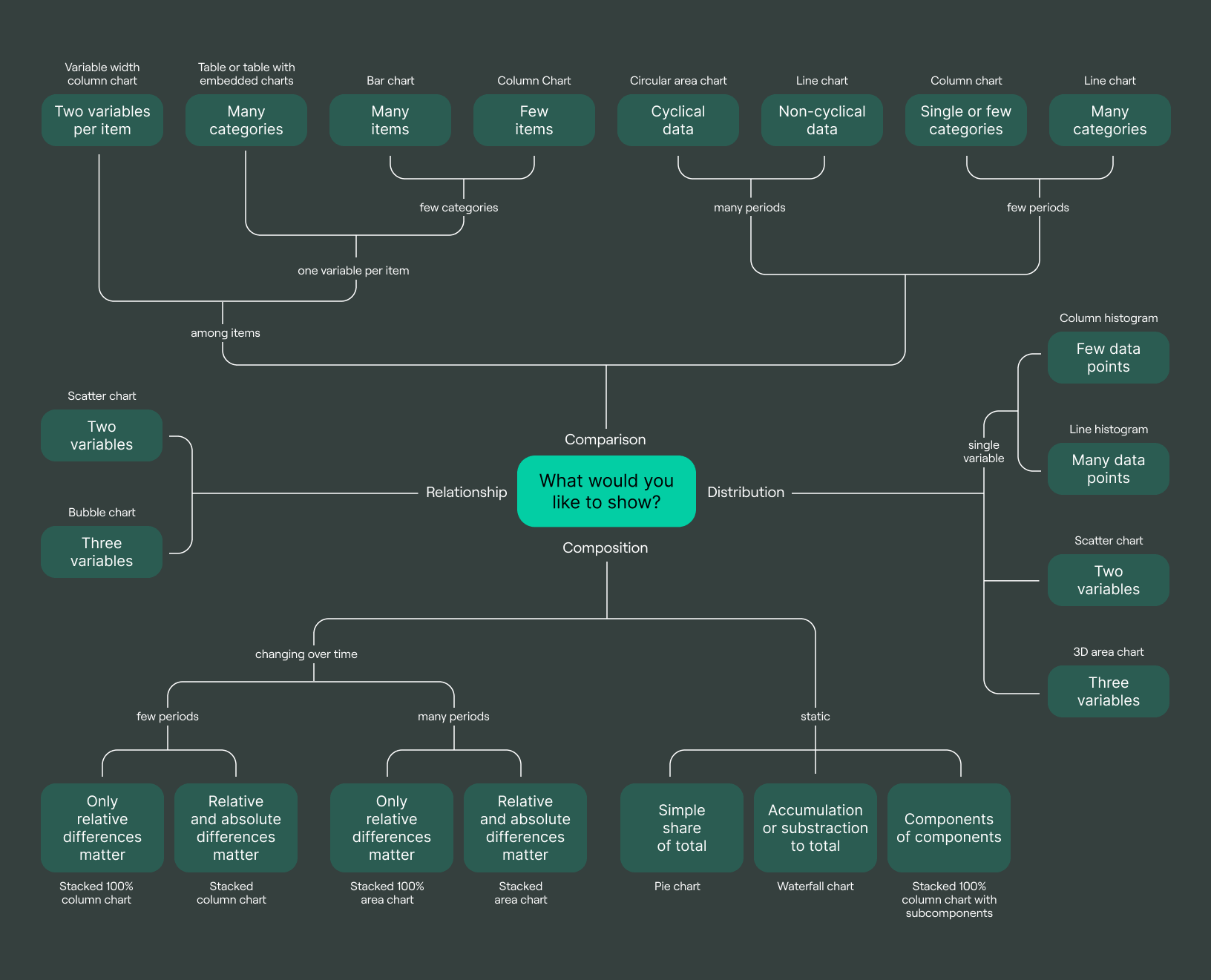
Business intelligence best practices involve a comprehensive understanding of visualization types. To make appropriate visualizations, it is essential to understand what you are trying to communicate. For example:
-
For comparison, use a bar chart or line chart.
-
For distribution, use the histogram or boxplot.
-
For composition, use a pie chart or stacked bar chart.
-
For relationships, use a scatterplot or correlation matrix.
Nitty-gritty details of visualization choice are given in the following image:

In this article, we’ll talk about:
6. Add context and explanations
Another significant BI best practice involves adding context to the visualizations. Adding context to the visualization makes it easier for the end-user to interpret BI reporting and use it in decision-making.
Explanation about the data journey, from where it was gathered, and how it was processed gives additional ground to the stakeholders in understanding data analytics. Moreover, adding appropriate explanations, such as Titles, and annotations, adds value to the visualization.
While adding an explanation, it is crucial not to add too much information that makes the visualization challenging to read.
7. Organize and structure your report
Creating a logical flow of your BI reports by dividing them into sections and subsections. This helps the stakeholders understand the progression of the analysis. For example, the sales report of an e-commerce store could include sections such as:
-
Sales Overview
-
Sales By product
-
Sales by region
-
Sales by channel
-
Profitability Analysis
-
Data-driven recommendations
Managed reporting clearly understands business objectives and provides relevant insights in an organized way. This way, stakeholders can easily trace key areas helpful in decision-making. Structured reports are also easy to modify.
8. Use interactive features
Incorporating interactive features into your BI dashboards can significantly enhance user experience. Interactivity enables users to explore data according to their needs.
Interactive features are as follows:
Hovering: This feature displays more information about the visualization when the user hovers over his mouse.
Drill-Down and Drill-Up: Drill-down allows the business user to explore specific data by clicking on it. For example, when exploring sales visualization, users can click on it to view sales by product or region. Contrarily, drill-up can help understand the holistic overview of sales.
9. Test and iterate
Testing and iterating is an integral part of the BI dashboard development process. It helps ensure that your dashboard is effective and serves the business needs. After completing the dashboard, the data analyst should test if everything runs fine for the end user.
The data team can also test the dashboard. Once it reaches the audience, they can provide feedback to improve the dashboard further. The team should repeat this process over time to fine-tune the BI dashboard.
10. Regularly update and maintain
Maintaining regular updates is necessary to keep the interactive dashboard relevant. It becomes necessary to ensure that all the data sources are up-to-date and data pipeline is working fine.
Regular business intelligence reporting helps businesses stay in touch with market trends. Stakeholders and executives can use the latest insights to make key business decisions.
Most common mistakes
1. Lack of clear objectives
If you fail to plan, you plan to fail. Understanding the reporting objectives is the first step in the business intelligence reporting process. Understanding the expectation of stakeholders regarding BI reporting is necessary for BI success.
2. Overloading with information
Overloading visualization with too many features or explanations falsifies the whole point of business intelligence reporting. Hence, selecting appropriate visualization with sufficient hues that engage the audience is essential. Secondly, there could be many insights when analyzing data, but selecting one that impactfully answers the business question is crucial.
3. Ignoring user feedback
Users, in our case, stakeholders, management, and data team are the ones for which we analyze data. Failing to incorporate user feedback reduces audience engagement. This ultimately leads to a potential loss of revenue from unactualized insights.
4. Make it perfect
Delaying BI reporting in hopes of perfection can be a bottleneck in business operations. Business analysts are advised not to waste too much time designing and selecting color combinations. However, it’s essential to create a reasonable first BI dashboard version.
5. Build EVERYTHING on Day 1
Improvement is a gradual but continuous process. Initially, your primary goal should be to create a minimum viable product enabling organizations to harness BI investments. With time, different reporting aspects, such as structure, colors, types of visualization, and explanation, can be modified.
Some great BI dashboards in DoubleCloud
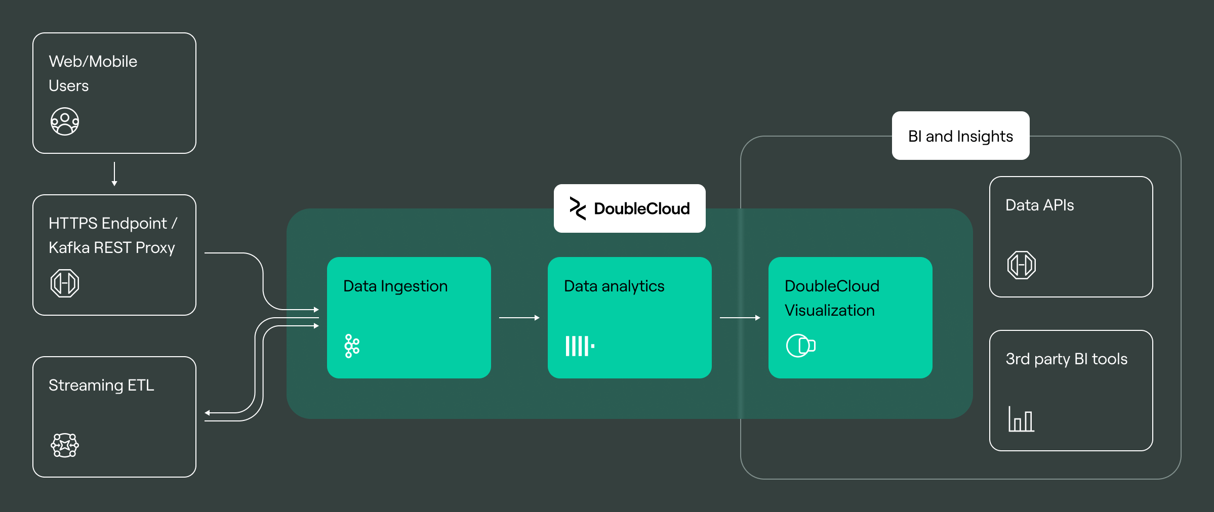
Got data infrastructure but not sure how to visualize it? Use DoubleCloud — a platform that allows sub-second data visualization.
DoubleCloud Visualization employs AI-powered GPT-4 to provide instant insights from data, offering concise, unbiased summaries in seven languages. Our free platform allows the quick creation of dashboards using data from various sources. The sources include ClickHouse, PostgreSQL, MySQL, and MS SQL Server.
With features such as embedded analytics, map layers, and geo types, DoubleCloud makes data analysis efficient. You can integrate charts into customer-facing applications, combine data from multiple sources on one dashboard. This ensures secure data handling with row-based filtering. DoubleCloud greatly simplifies data visualization and decision-making.


DoubleCloud Visualization. Get insights with ChatGPT!
Don’t waste time reading numerous reports and manually analyzing data — rely on AI-Insights and get fast and accurate conclusions.
Example 1 — TripleTen
TripleTen, facing significant challenges with Metabase, switched to DoubleCloud for its BI needs. DoubleCloud’s platform enabled TripleTen to connect to their PostgreSQL database and efficiently handle large data. Implementing changes and adding reports, tabs, and dashboards became a quick process.
Example 2 — Beetested
Beetested, a video game testing platform, uses DoubleCloud’s Managed ClickHouse® solution to analyze and store millions of gamers' emotional reactions efficiently. The startup saves valuable time with DoubleCloud’s visualization tool, embedding analytics directly from data stored in their ClickHouse clusters.
This advanced solution replaces the time-consuming process of creating .pdf reports, allowing quicker insights for game developers.
Final words
A BI dashboard is a visualization tool that creates interactive visualizations from various business data sources. The BI dashboard aims to extract insights from the data to help stakeholders in decision-making. Understanding business objectives is the first and most crucial step in BI reporting.
Secondly, explaining data sources creates a context for end-user in interpreting visualization. Ensuring the BI system is easily readable makes it engaging for the audience. After finalizing the dashboard, the next step is to test and improve it by understanding user pain points.
While making the dashboard, the business analyst should avoid repeating common mistakes such as overloading visualization, ignoring user feedback, etc.
Frequently asked questions (FAQ)
What is the purpose of a BI dashboard, and why should businesses use one
What is the purpose of a BI dashboard, and why should businesses use one
The purpose of BI dashboards is to extract insights from data visualizations that help executives in decision-making. Businesses use BI dashboards for two significant purposes Regular BI Reporting and Ad hoc reporting. The end goal is data-driven decision-making.
What are the features of good reporting in business intelligence?
What are the features of good reporting in business intelligence?
How do I determine the right visualizations for my BI dashboard?
How do I determine the right visualizations for my BI dashboard?
How often should I update and maintain my BI dashboard?
How often should I update and maintain my BI dashboard?
Start your trial today


